Zentra
Mobile Banking App Concept
A self-initiated concept for a mobile banking app, a design exploration pushing craft on one of the hardest surfaces in product design: finance on a small screen, where trust, clarity, and speed all compete. Includes a complete visual system, the core money flows from transfer to confirmation, and trust-first authentication screens.
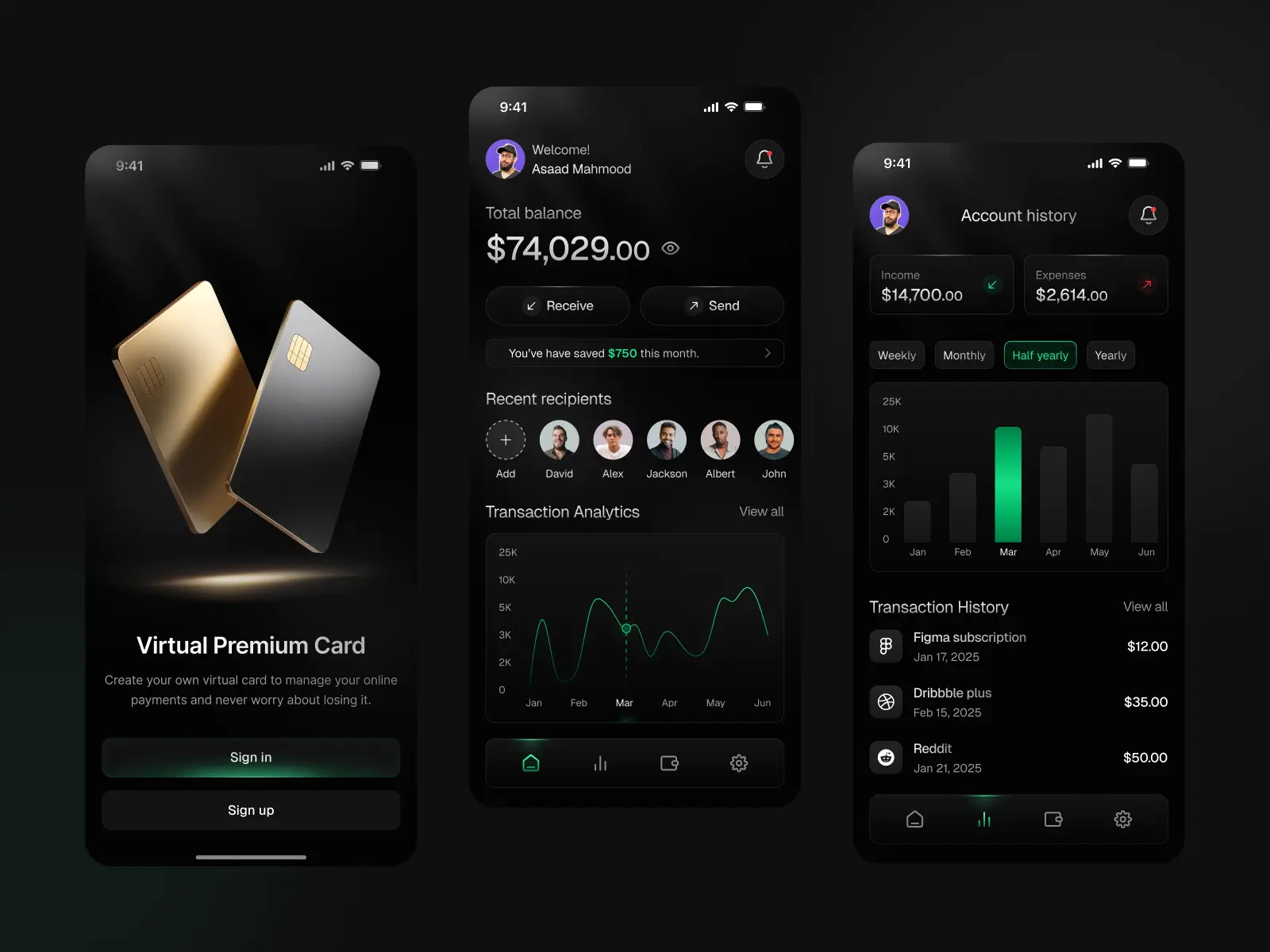
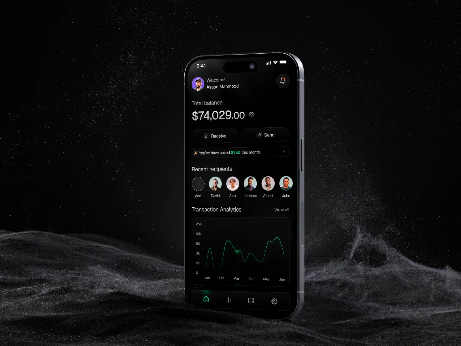
A concept study in high-craft mobile product design
Zentra is a self-initiated concept for a mobile banking app, a design exploration we used to push our craft on one of the most demanding surfaces in product design: a finance app on a small screen, where trust, clarity, and speed all have to coexist in a few hundred pixels. It is a concept rather than a shipped product, which let us focus entirely on the quality of the experience and the visual system, free of legacy constraints.
Mapping the experience first
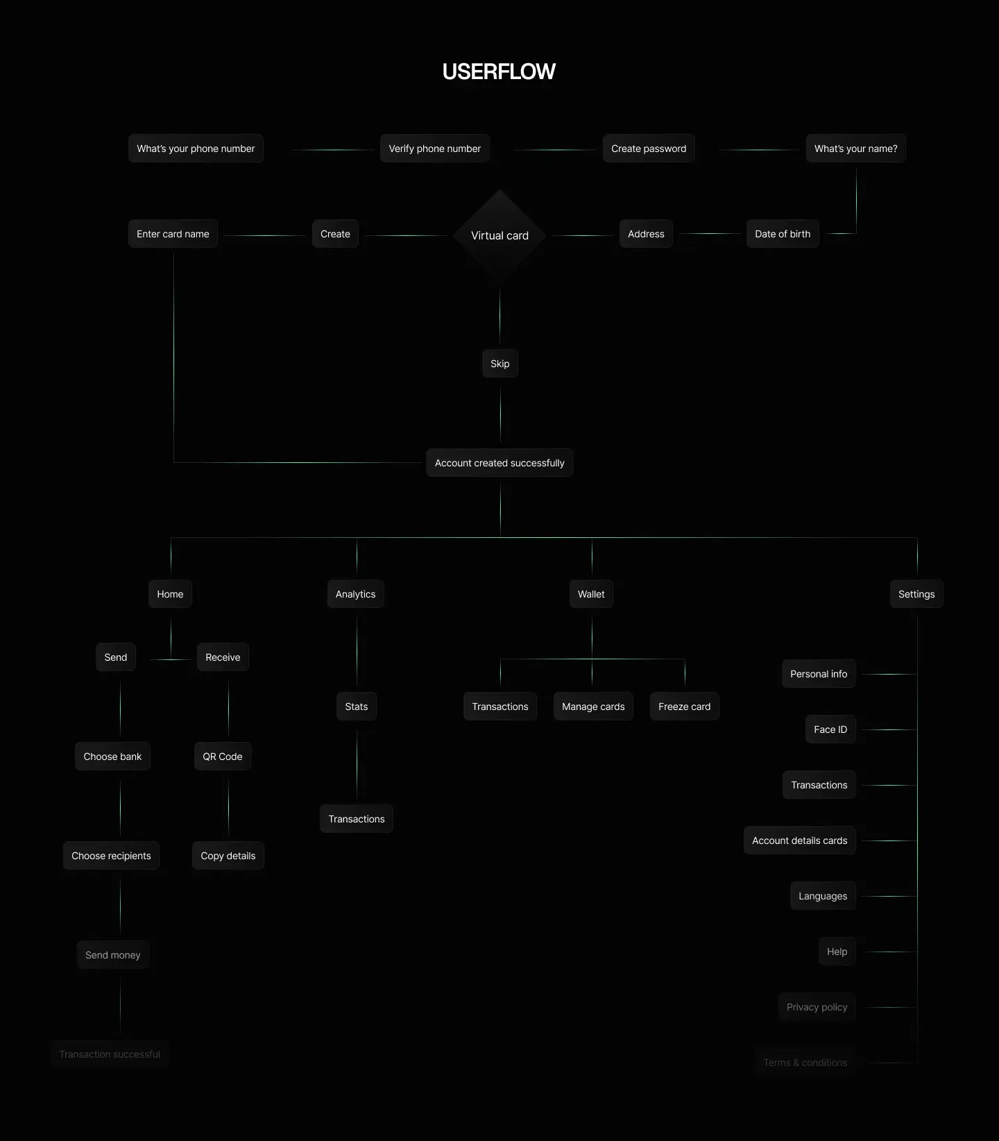
Before designing a single screen, we mapped the app as a flow, how a user moves from opening the app to completing a real task. For a finance product this matters more than usual: every extra step is a chance to lose confidence, so working out the journey up front is what keeps the screens that follow fast and logical rather than a collection of pretty but disconnected views.
The brief we set ourselves
Money apps face a hard tension: they have to feel secure and serious, yet stay effortless to use under a thumb in a few seconds. We set out to design a mobile finance experience that resolves that tension, premium and trustworthy in tone, but fast and frictionless in the moments that matter, sending money, checking a balance, reviewing history. The concept is built around a dark, restrained visual system with a sharp accent color, the kind of look that reads as modern and credible in the finance space.
A complete visual system
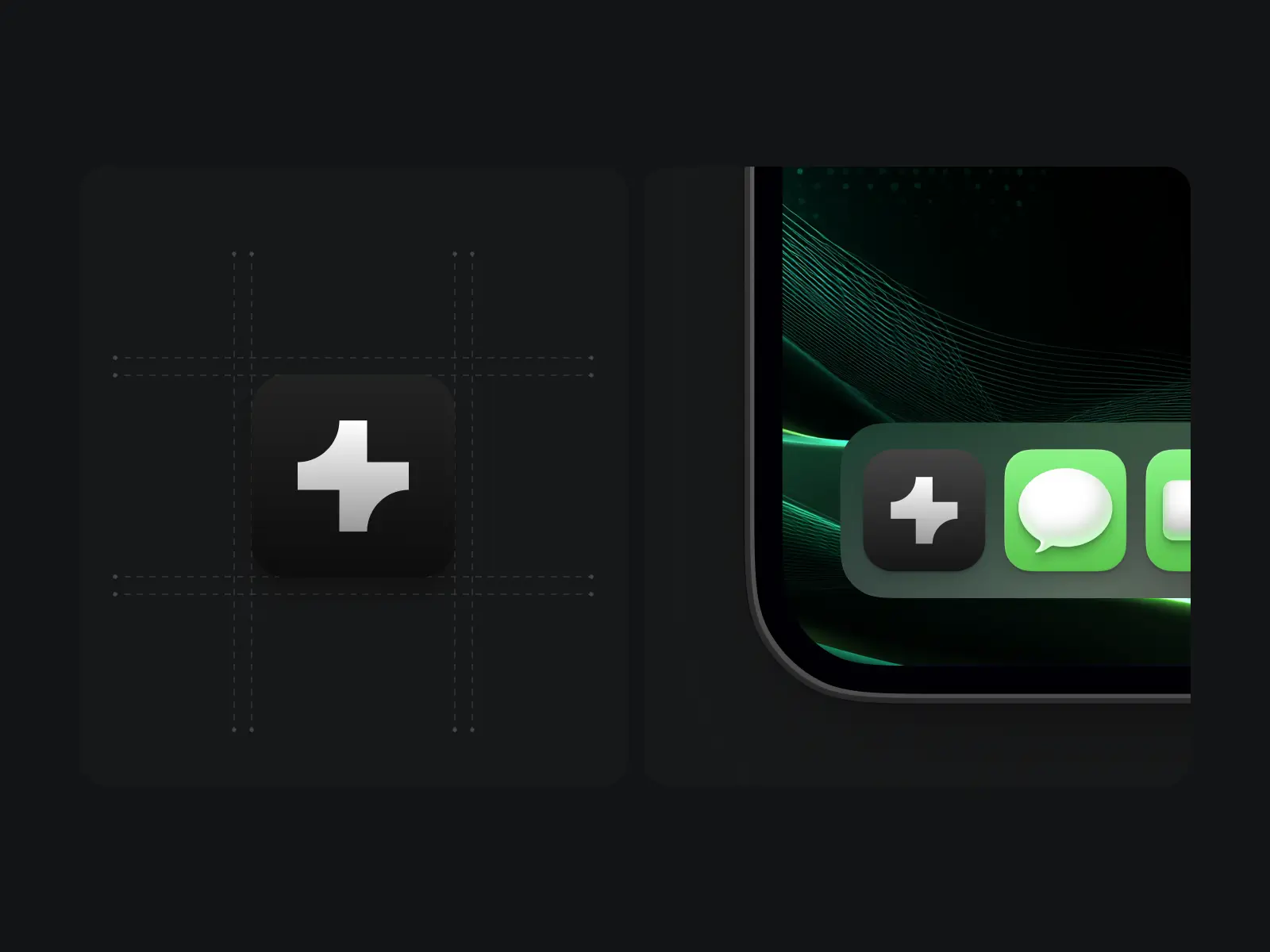
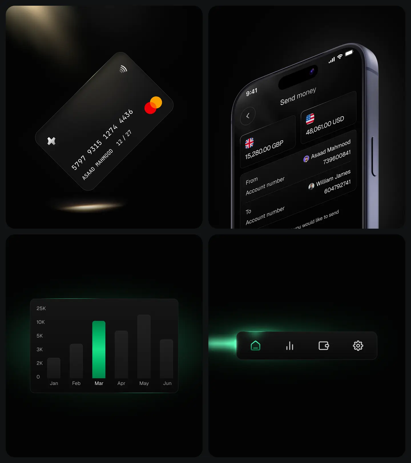
The concept includes its own foundations: a wordmark, a display and text type system, and a dark color palette with a single confident accent. Designing the brand and the product together is what gives the screens their coherence, every surface clearly belongs to the same app.
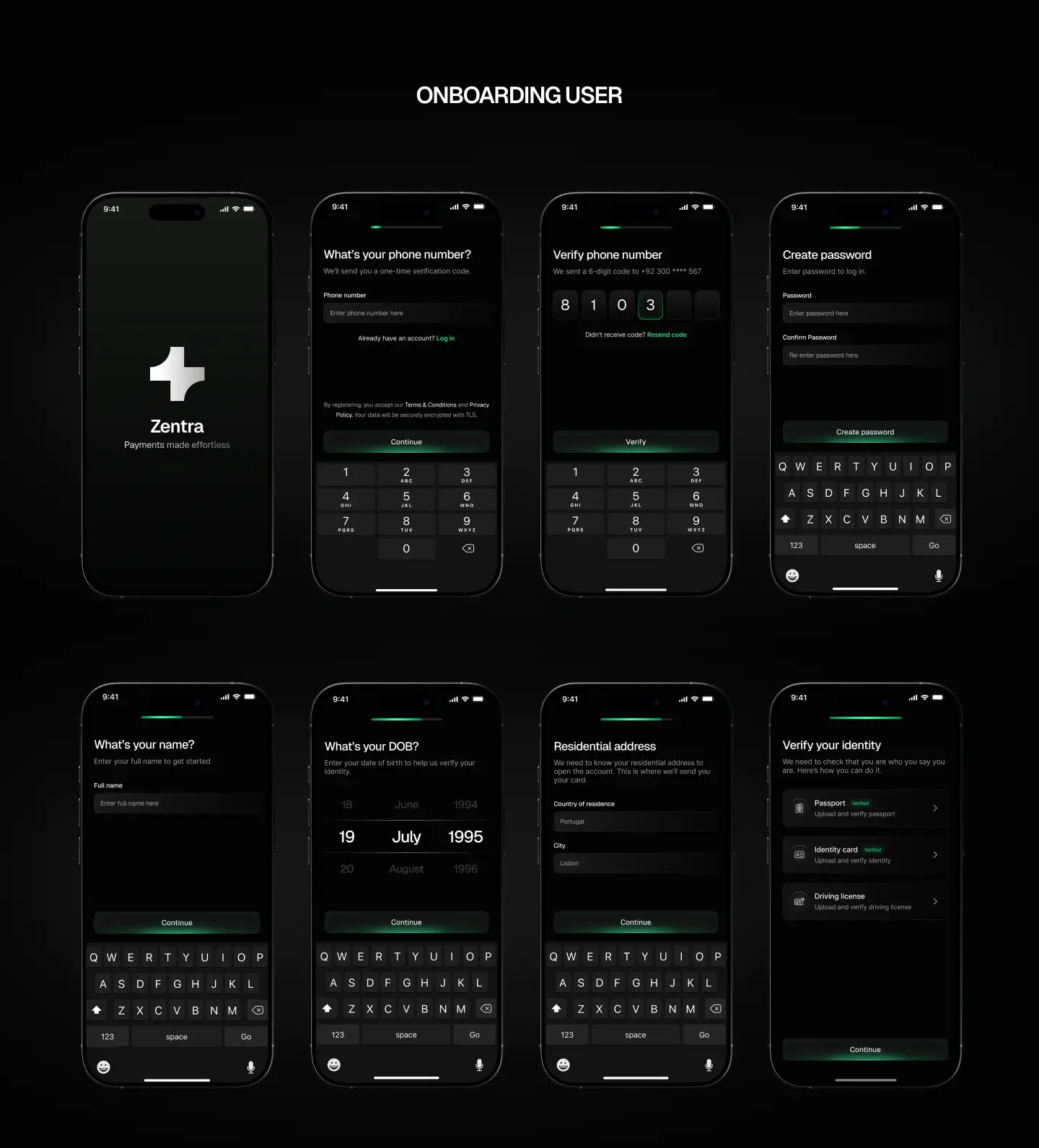
Onboarding
First impressions in finance are trust impressions. We designed the onboarding so a new user understands the app and feels safe handing it their money within the first few screens, setting the confident, premium tone the rest of the experience carries.
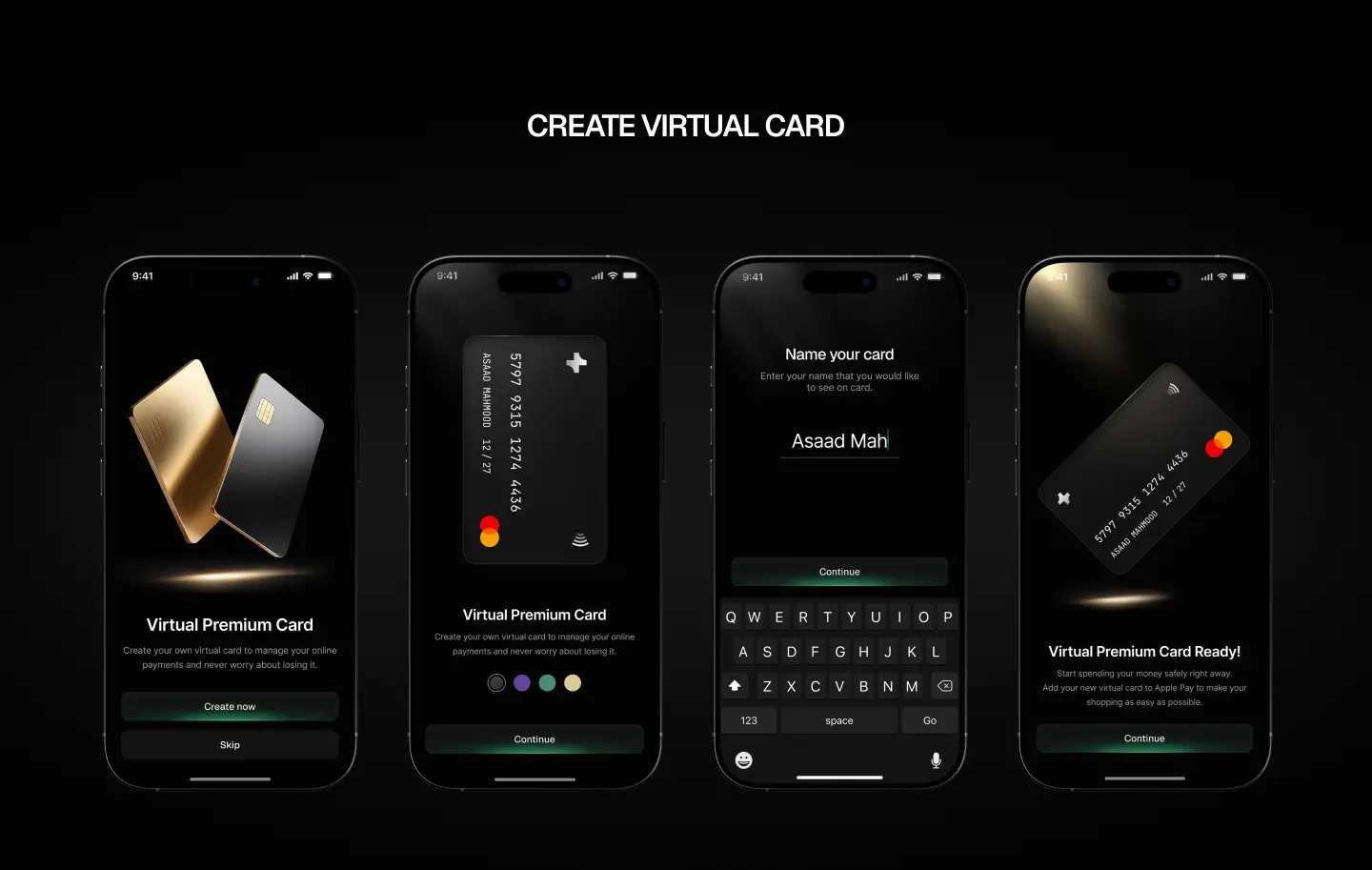
Cards and the core money flows
At the center of the experience sit the everyday actions a finance app lives on: viewing balances and cards, and the virtual card itself. We designed these for speed and reassurance in equal measure, clear at every step, with the card and balance information presented so a user always knows where they stand at a glance.
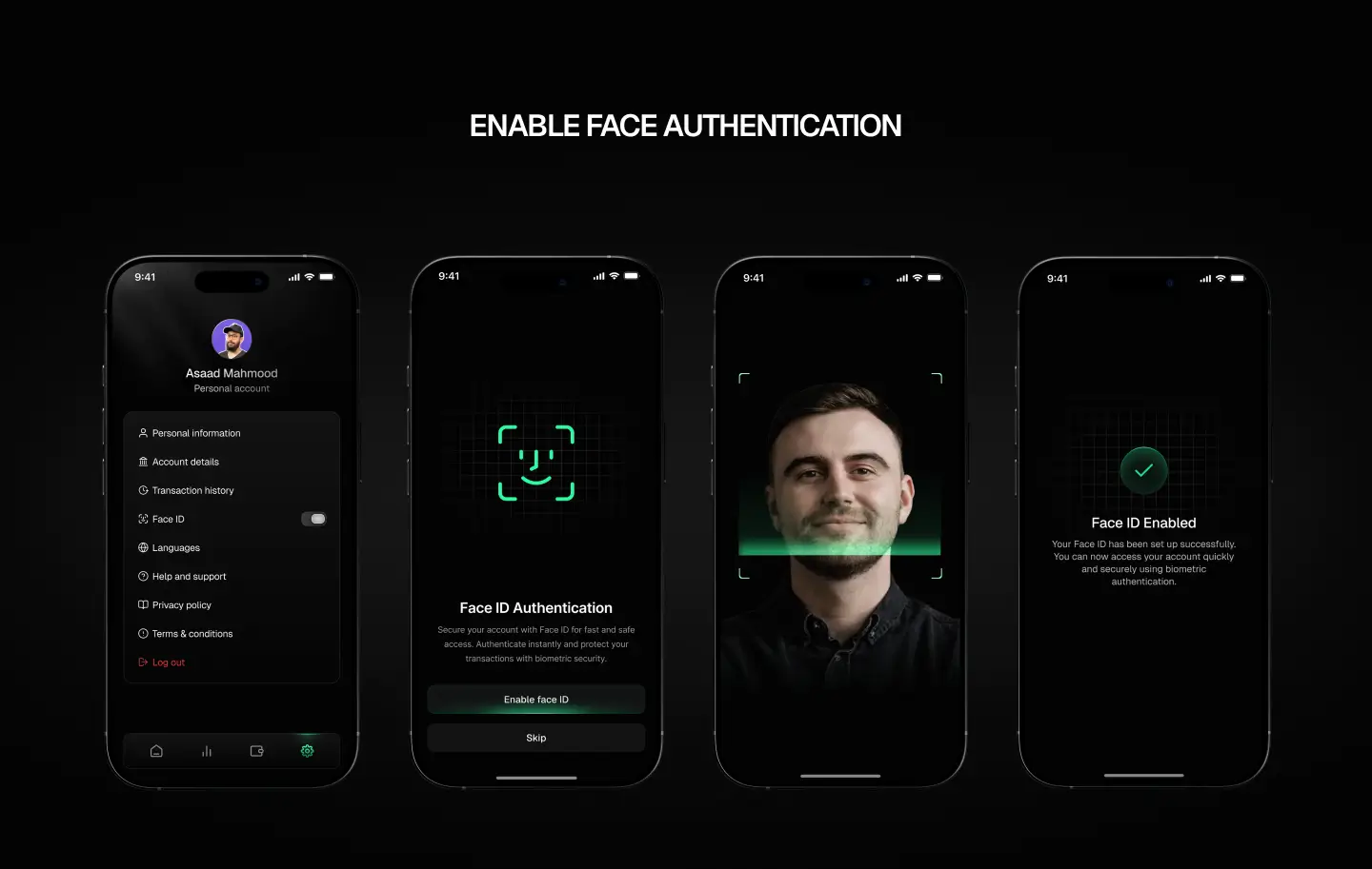
Security and authentication
Trust is the product in finance, so the concept treats authentication and data security as first-class screens rather than an afterthought. Face authentication and the security flows are designed to feel protective without becoming a wall the user has to fight through on every action.
Why we built it
Zentra is a concept, and its purpose is to demonstrate craft: how we handle a dense, trust-critical mobile experience, from mapping the flow to a complete visual system to the small-screen interaction detail that separates a polished app from a rough one. It is a clear example of the visual and interaction quality we bring to mobile product work, applied to a deliberately high-bar surface.
%20(1).png)
.webp)
.webp)
Accepted Payments

