Arbling
AR Try-On Technology for Jewellery Retailers
End-to-end product design for Arbling, a pre-launch startup selling luxury AR try-on technology to jewellery retailers. One engagement spanning brand, a retailer-facing SaaS dashboard, photorealistic AR try-on with hand and ear tracking, a 3D ring configurator, a full mobile shopping app, ecommerce, and the pitch artifacts the team raised on. Nine deliverables, one design system.
.webp)
One engagement, a complete AI and AR jewelry platform
Arbling came to us pre-launch with a sharp B2B premise: sell luxury AR try-on technology to jewellery retailers, so their shoppers can see a piece on their own hand or ears before buying. Starting from zero is the hardest brief in product design, there is no system to lean on, and a platform sold to retailers has to look credible enough that established jewelry brands will put it in front of their own customers. We took on the full design scope: nine coordinated deliverables across brand, SaaS, AR, mobile, and ecommerce, on one design system.
Brand foundation
With nothing to start from, the brand guide came first. We built a restrained luxury system, Syne paired with SF Pro, a Pearl White and Dark Matter palette, editorial close-up jewelry photography, and a full UI component library down to buttons, inputs, and icons. For a company whose product gets embedded inside other premium brands' storefronts, this restraint is strategic: the design has to read as luxury without overpowering the retailer's own identity. It is also why nine separate deliverables feel like one product rather than three vendors' work stapled together.
.webp)
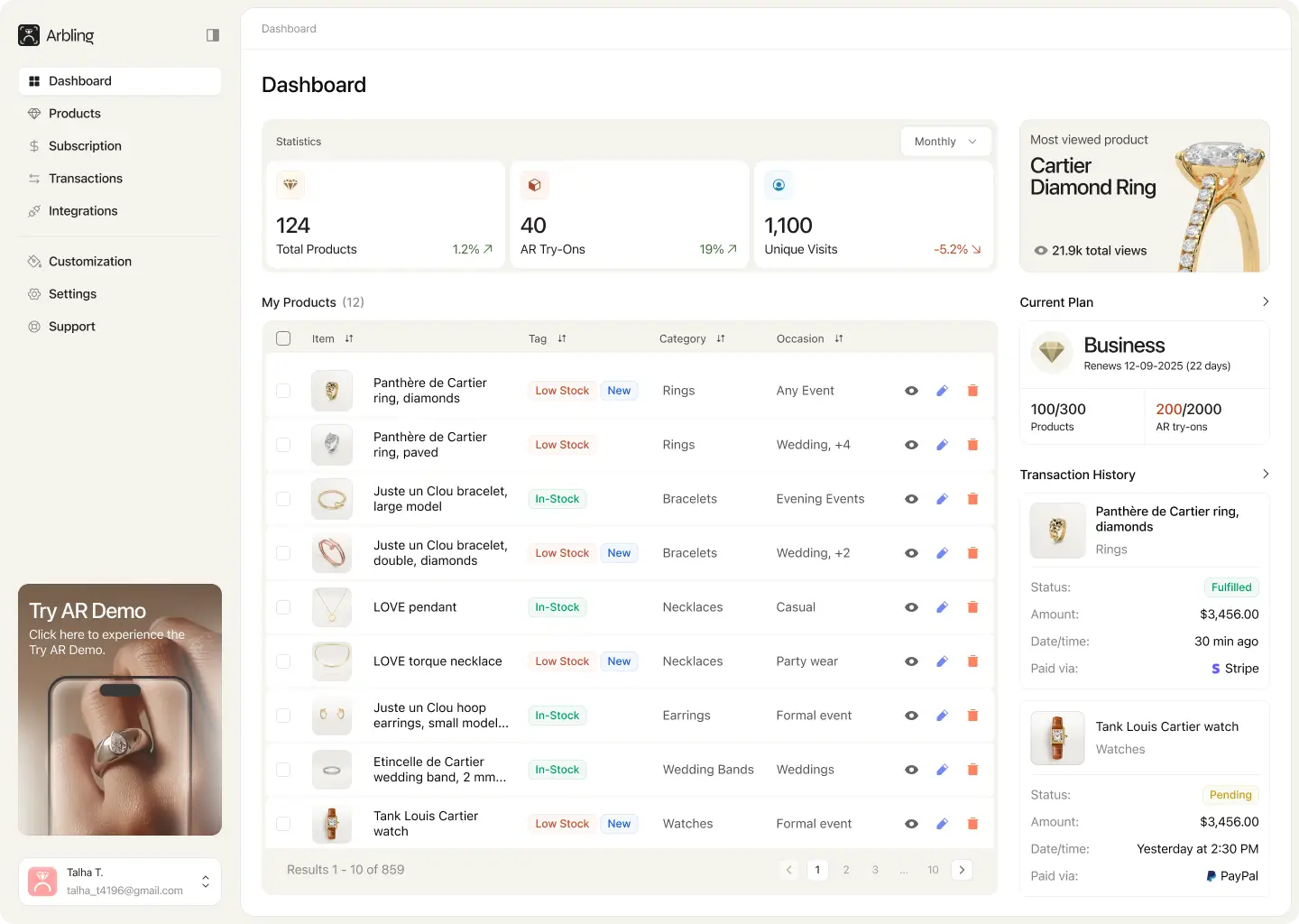
The SaaS dashboard
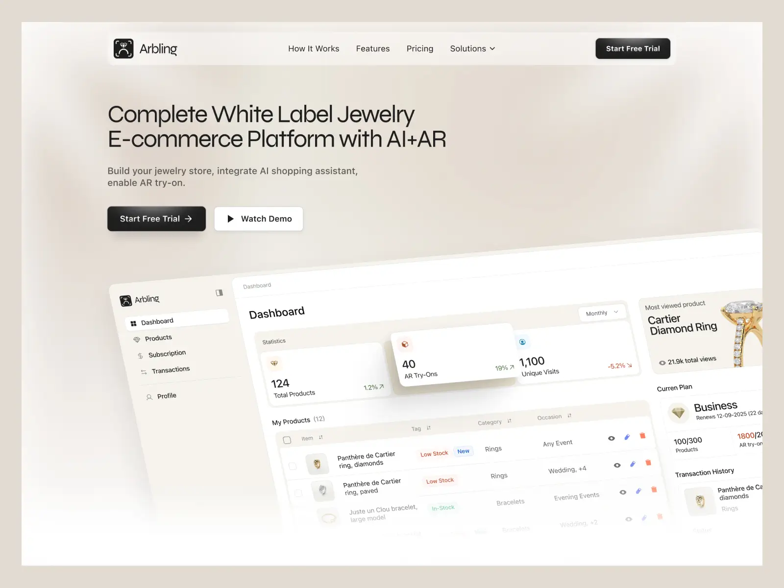
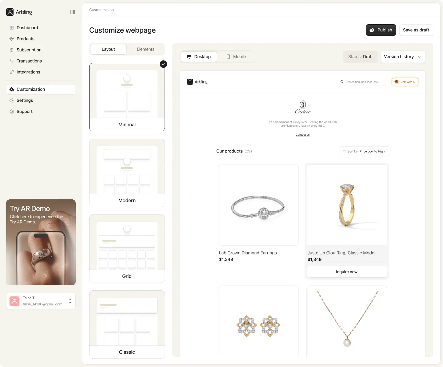
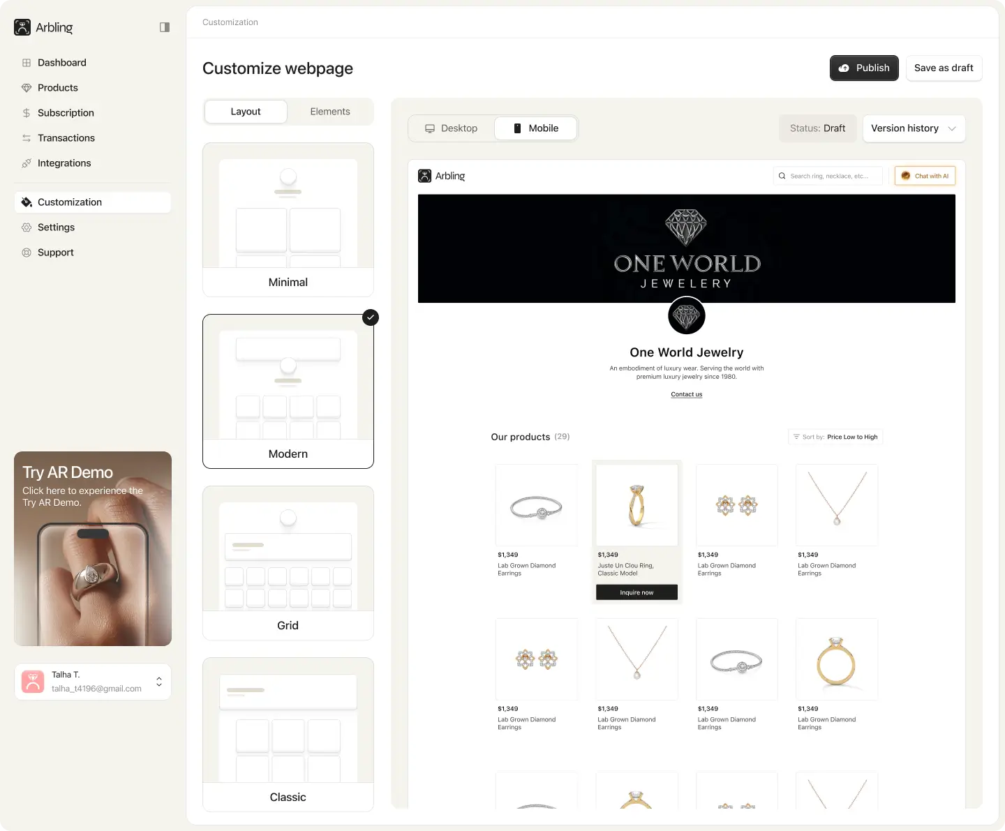
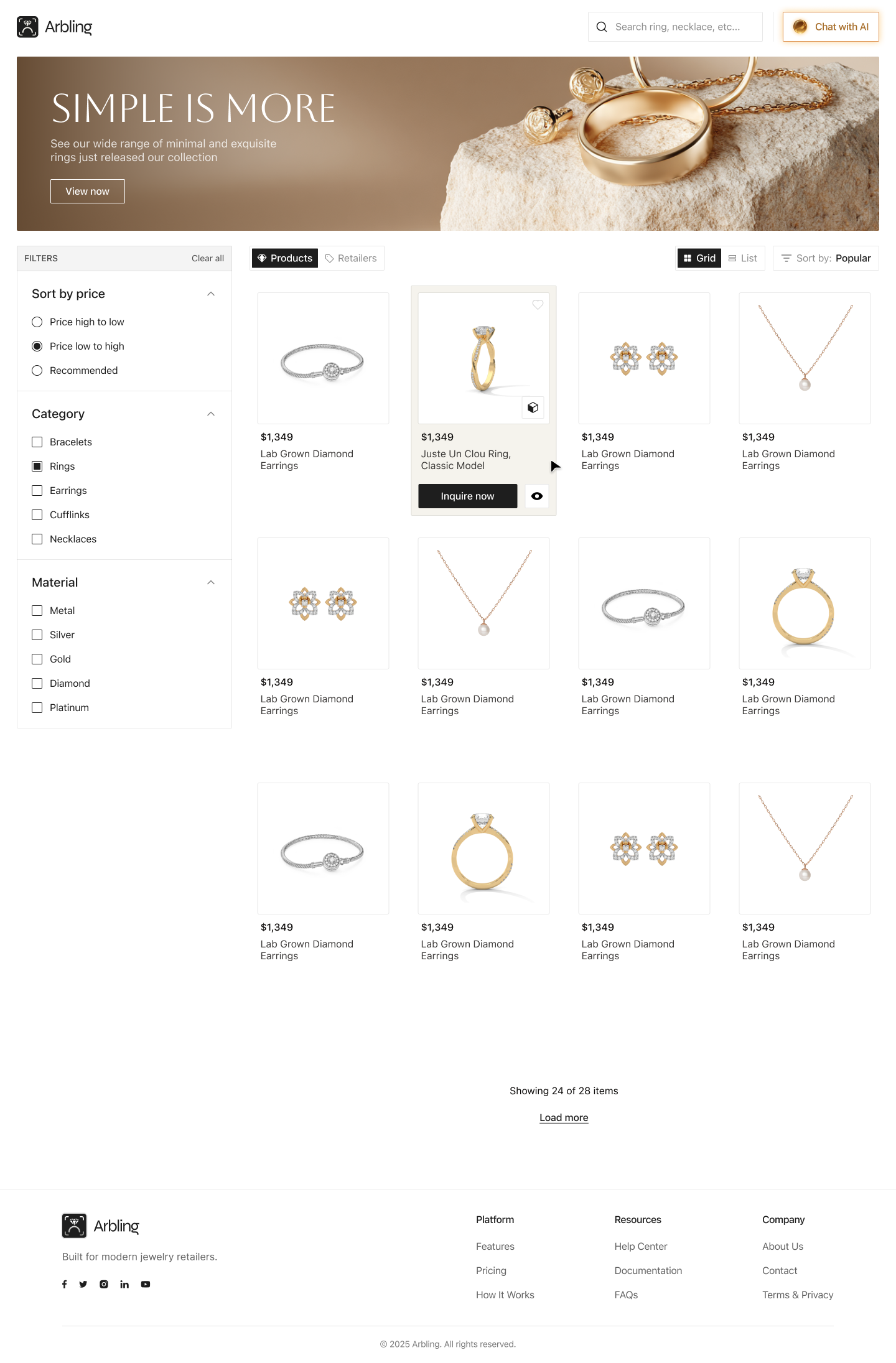
The core product retailers actually log into: a SaaS dashboard for managing catalog, inventory, and the AR-enabled product experience. We designed it with the discipline any data-dense B2B tool demands, a clear hierarchy that surfaces high-frequency actions first, an interface that stays legible as the catalog grows, and a structure that absorbs new modules without a redesign. This is the operational backbone every customer-facing surface plugs into.

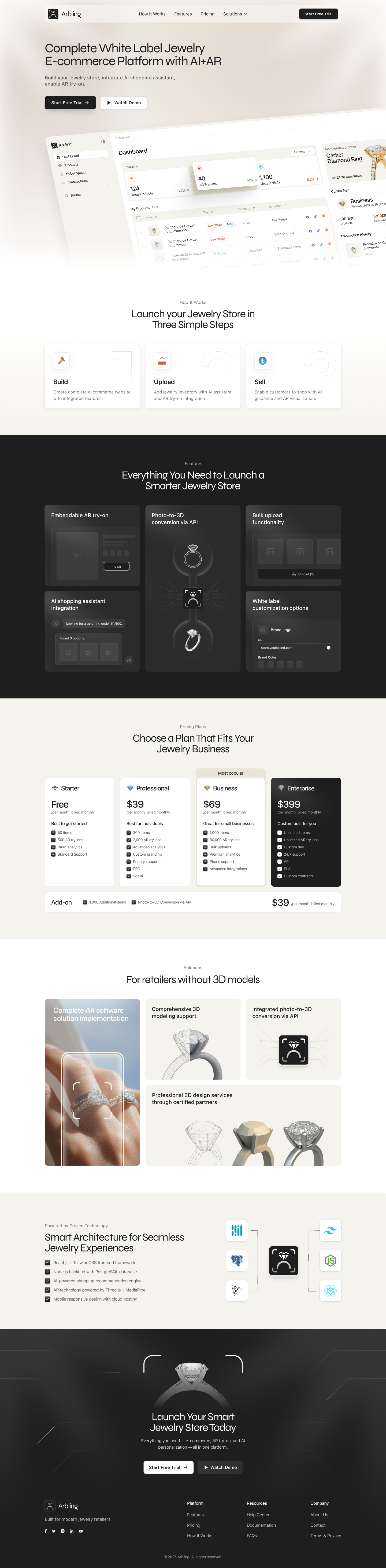
SaaS landing page
The marketing site that sells the platform to retailers. It leads with the core promise, “luxury AR try-on technology for jewellery retailers,” then makes the case the way a B2B buyer needs: photorealistic AR jewelry with advanced hand and ear tracking, a live 3D experience, enterprise-grade security and performance, and a feature set built for retailers who demand more. The page has to convert a serious B2B buyer, not just look pretty, so every section maps to a real objection a retailer would raise before adopting.
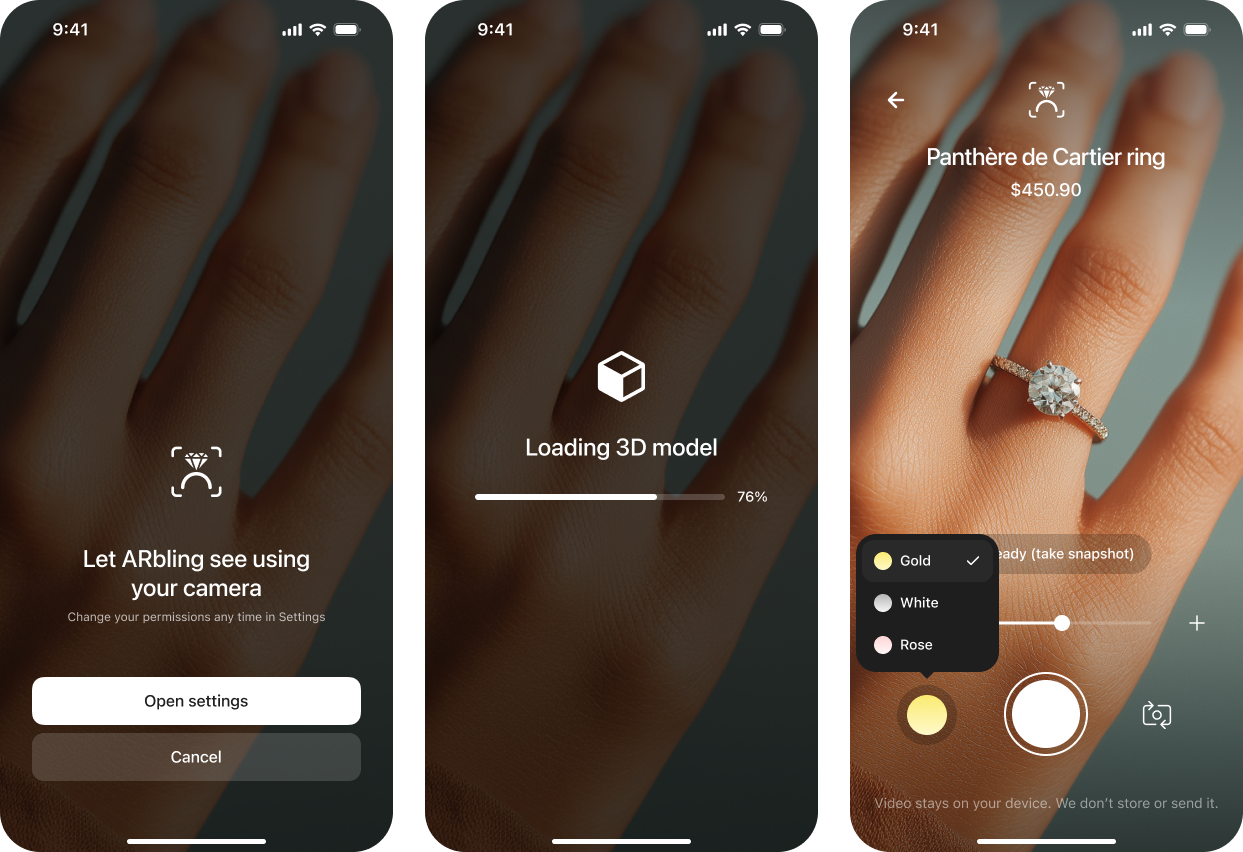
AR try-on experience
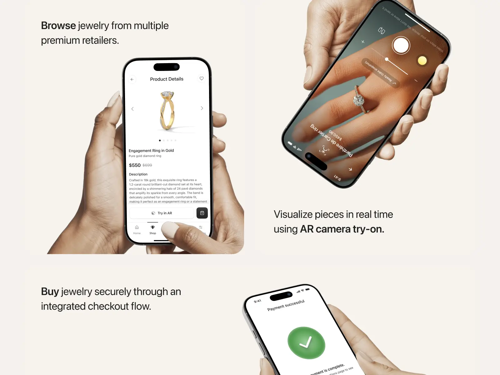
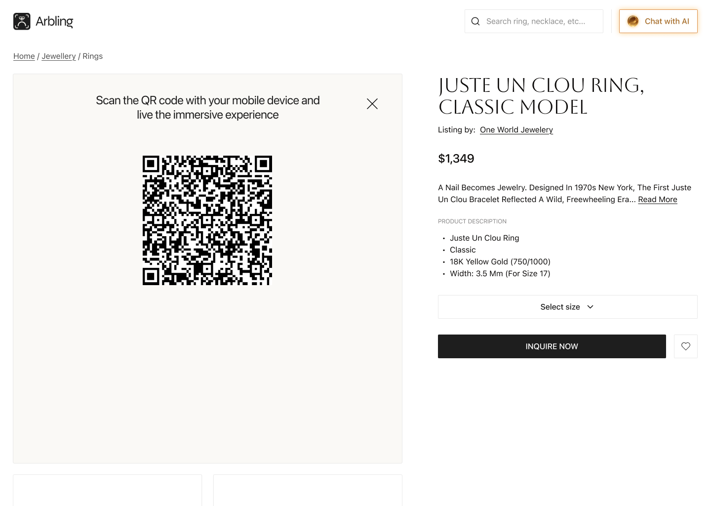
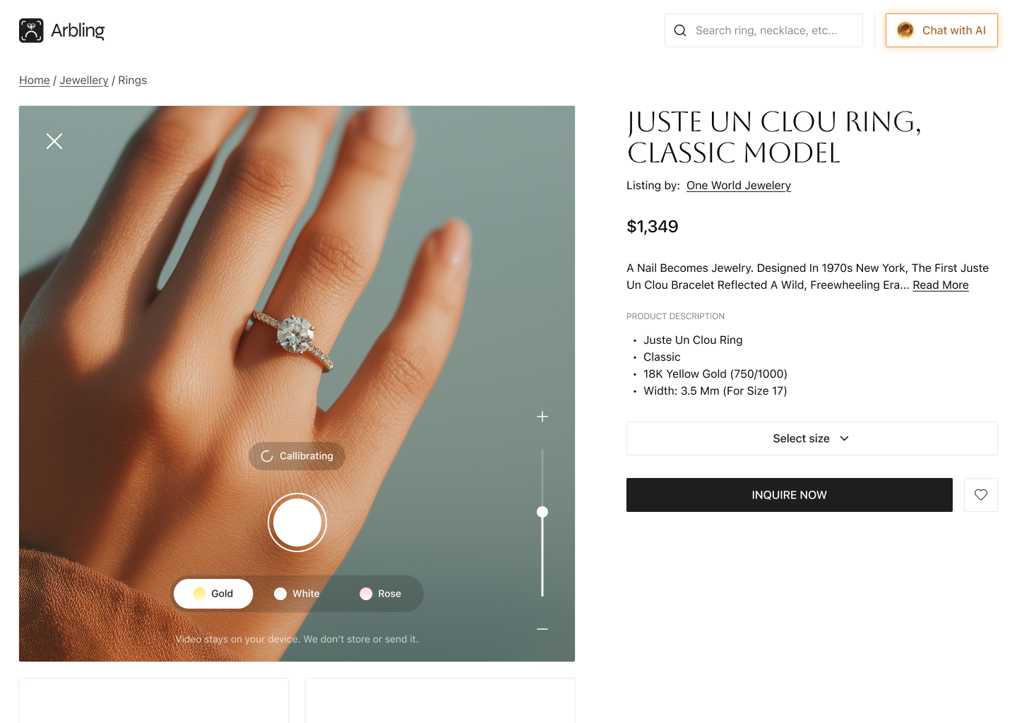
The differentiator, and the whole reason Arbling exists. We designed the AR try-on experience that lets shoppers see jewelry on themselves in real time, with hand tracking for rings and ear tracking for earrings, photorealistic rendering, and true gemstone refraction. This attacks the single biggest objection in online jewelry: you cannot feel it through a screen. The design had to make a technically complex AR interaction feel effortless, because the instant try-on feels fiddly, the conversion advantage evaporates. Done right, it turns a high-consideration, high-return-rate purchase into a confident one.
.webp)
3D viewer and configurator
A 3D viewer lets a shopper personalize a piece and watch the price update live, then view it in 3D and try it on in AR. On a wedding ring, for example, the buyer chooses the metal (white, rose, or yellow gold), the stone shape (oval, cushion, or round), and whether to add diamond pavé, each option re-rendered photorealistically in real time. For jewelry, where personalization drives both emotional attachment and price, a tactile way to make a piece your own is a direct lever on conversion and average order value.
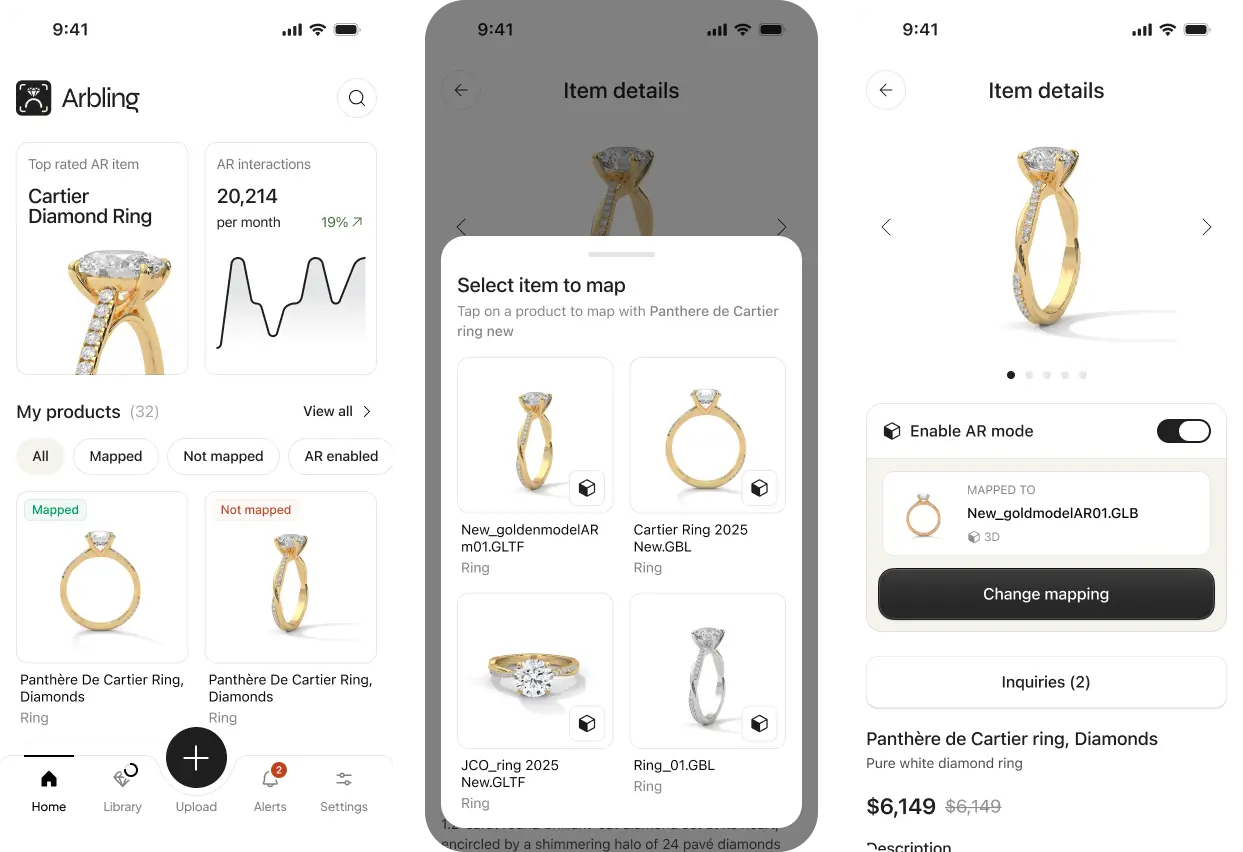
Mobile shopping app
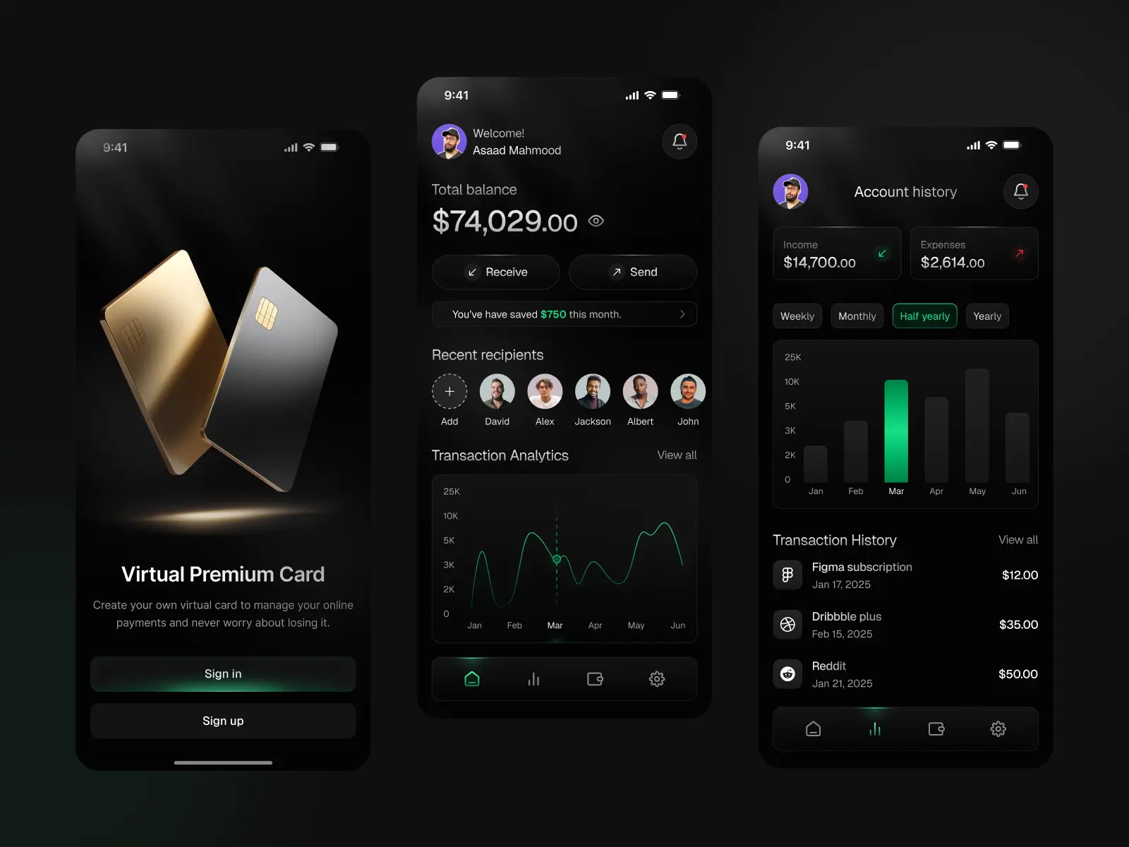
We carried the system onto mobile end to end: AR try-on, product detail pages, category browsing, and the full purchase flow. The test of a design system is whether it survives a second platform, and this one did, rebuilt around native patterns and touch-first interactions rather than a desktop layout crammed onto a phone. Since AR try-on happens on the device a shopper already holds to their hand or face, mobile is not a secondary surface here, it is where the core experience lives.
Ecommerce and checkout
The conversion layer: cart, checkout, and the purchase flows that turn a try-on into revenue. For a platform a retailer is trusting with their customers, checkout has to feel as considered and credible as the brand promises at the top of the funnel, and strip friction at the exact point where most stores lose the sale.
Pitch artifacts
A pre-launch startup has to sell the vision before it can sell a product, so we also designed the pitch deck and one-pager the team would raise on. These carry the exact visual system as the product itself, so what an investor sees in the deck is what they get in the platform, no gap between the promise and the thing being funded. For an early-stage company, that consistency is part of what makes a raise credible.
Why the range matters
Most studios hand off one slice and leave the seams to someone else. Arbling is the opposite: one team taking a company from a blank page through brand, a retailer-facing SaaS platform, AR try-on technology, mobile, ecommerce, and the raise itself, on a single coherent design system. For a founder, that means no integration tax between vendors, no drift between marketing and product, and one partner accountable for the entire experience.
%20(1).png)
.webp)
Accepted Payments

