Why Your SaaS Looks Great But Still Feels Difficult to Use

A visually impressive SaaS product does not automatically guarantee a great user experience. Many startups spend thousands creating sleek interfaces, modern animations, and beautiful dashboards, yet users still abandon the platform after only a few interactions. The problem usually isn’t the appearance — it’s usability.
Today’s users expect software to feel effortless. If navigation feels confusing, workflows become frustrating, or tasks take too long to complete, even the best-looking product can struggle with conversions and retention. This is why many startups now partner with a professional saas web design agency that focuses not only on visuals but also on user behavior and conversion-focused experiences.
The Difference Between Good Design and Good UX
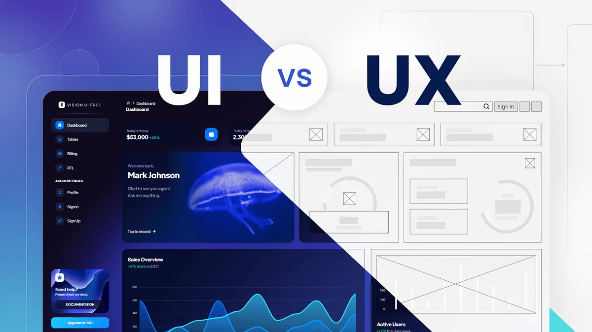
Many people confuse UI with UX. While UI focuses on visual appearance, UX focuses on how users interact with the product.
A platform can have:
- Beautiful colors
- Smooth animations
- Modern typography
- Stylish dashboards
But still feel frustrating to use.
Great UX is about reducing effort. Users should instantly understand:
- What your product does
- Where to click
- How to complete tasks
- What action comes next
When users need to “figure things out,” friction increases.
The Biggest Reason SaaS Products Feel Difficult

The most common problem is overdesigning. Founders often try to impress users with too many features, advanced dashboards, and excessive functionality from the start.
Instead of simplicity, users experience:
- Cluttered interfaces
- Too many navigation options
- Overwhelming dashboards
- Complicated onboarding flows
- Feature overload
The result? Users feel mentally exhausted before they experience the actual value of the product.
Modern SaaS success depends on making complex systems feel simple.
1. Confusing Navigation Creates Frustration
Navigation should feel invisible. Users should naturally know where to go next without thinking too much.
However, many SaaS platforms make mistakes like:
- Too many menu items
- Hidden important features
- Inconsistent page structures
- Unclear labels
- Multiple CTAs competing for attention
When navigation lacks clarity, users lose confidence in the platform.
How Better Navigation Improves UX
Strong navigation helps users:
- Complete actions faster
- Feel more confident
- Explore features naturally
- Stay engaged longer
Minimal and intentional design usually performs far better than overcrowded layouts.
2. Too Many Features Too Early
Many Future of SaaS companies believe adding more features creates more value. In reality, too many visible options often reduce usability.
New users don’t want to learn everything immediately. They simply want to solve one problem quickly.
A smarter approach includes:
- Progressive feature exposure
- Simplified onboarding
- Contextual tooltips
- Focused workflows
The best SaaS experiences guide users gradually instead of overwhelming them on day one.
3. Slow Interfaces Break User Momentum
Users expect modern software to respond instantly. Even slight delays can make a product feel unreliable.
Common performance problems include:
- Heavy animations
- Poor optimization
- Slow dashboard loading
- Delayed button responses
- Excessive scripts
Fast products feel easier to use because they reduce friction and maintain user flow.
A reliable saas development agency understands that performance optimization is a critical part of user experience, not just a technical requirement.
4. Poor Onboarding Makes Users Quit Early
Even strong products lose customers because onboarding experiences are too complicated.
Bad onboarding often includes:
- Long tutorials
- Excessive setup forms
- Too much information upfront
- Technical language users don’t understand
Users should experience value quickly. If they cannot understand your platform within minutes, retention becomes difficult.
Better Onboarding Strategies
Successful SaaS products often:
- Use guided walkthroughs
- Break tasks into smaller steps
- Highlight one key action at a time
- Remove unnecessary setup friction
Simple onboarding creates confidence.
5. Inconsistent Design Patterns Confuse Users
Consistency is one of the most underrated aspects of UX.
When buttons, layouts, colors, or interactions behave differently across screens, users feel uncertain.
Examples of inconsistency:
- Different button styles on separate pages
- Changing navigation locations
- Different terminology for similar actions
- Mixed spacing and typography
Consistency builds familiarity, and familiarity makes products easier to use.
6. Lack of User Feedback During Actions
Users need reassurance that the system is working.
Without proper feedback:
- Users click buttons repeatedly
- Forms feel broken
- Loading processes feel confusing
- Actions seem incomplete
Good UX includes:
- Loading indicators
- Success confirmations
- Helpful error messages
- Smooth transitions
These small details create a more polished and trustworthy experience.
7. Designing for Everyone Instead of Ideal Users
Many SaaS products fail because they try to satisfy everyone at once. The result is a generic experience that feels unclear.
Strong UX starts with understanding:
- Who the user is
- What problem they need solved
- What their priorities are
- How they behave digitally
The more focused the experience, the easier the product feels to use.
This is why businesses investing in professional saas web design services often achieve better conversion rates and stronger long-term retention.
8. Aesthetic Design Without Functional Purpose
Sometimes beautiful design elements actually hurt usability.
Overused effects like:
- Complex animations
- Fancy transitions
- Experimental layouts
- Unusual scrolling behavior
may look impressive but create confusion.
Modern SaaS design should prioritize:
- Clarity
- Accessibility
- Speed
- Simplicity
- Intuitive interaction
Design should support usability — not compete with it.
9. Ignoring Real User Behavior
Many SaaS founders make assumptions about how users interact with their products. Real behavior is often very different from expectations.
Successful SaaS companies continuously improve UX through:
- User testing
- Heatmaps
- Session recordings
- A/B testing
- Customer interviews
Small usability improvements can dramatically increase:
- Trial signups
- Retention
- Paid conversions
- Customer satisfaction
The best digital products evolve constantly based on real-world usage.

Final Thoughts
A SaaS product doesn’t fail because it looks bad. Most products fail because they create unnecessary friction during the user journey.
When software feels simple, intuitive, and effortless, users stay engaged longer and convert more easily. Great UX is not about adding more features or making interfaces flashy — it’s about removing confusion and helping users achieve results quickly.
Modern startups that prioritize usability, performance, and strategic product design consistently outperform competitors in crowded markets. Brands looking to create intuitive, scalable, and high-converting SaaS experiences often partner with agencies like The Small Square.


Accepted Payments

