What Makes a Modern Website Truly User-Friendly?

In today’s digital landscape, users expect more than just an attractive website. A modern website must be intuitive, fast, and easy to navigate. If visitors struggle to find information, experience slow load times, or feel confused about what to do next, they will likely leave within seconds.
A user-friendly website focuses on delivering a smooth and enjoyable experience for visitors. It helps users accomplish their goals quickly while also guiding them toward key actions such as signing up, purchasing, or contacting the business.
Understanding what makes a modern website truly user friendly can help startups and businesses create platforms that not only look great but also perform effectively.
Clear and Intuitive Navigation
One of the most important aspects of a user-friendly website is navigation. Visitors should be able to find what they need within seconds.
A well-structured navigation system includes:
- Simple and clearly labeled menu items
- Logical page hierarchy
- Easy access to important pages
- A visible call-to-action
When users instantly understand where to click, their experience becomes smoother and frustration is reduced.
Modern websites often use minimal navigation structures with focused options instead of overwhelming visitors with too many choices.
Fast Loading Speed

Website speed plays a major role in user experience. Studies show that users often leave websites that take longer than a few seconds to load.
Fast-loading websites create a smoother browsing experience and help keep visitors engaged.
Key ways to improve website performance include:
- Optimizing images and media files
- Using efficient code and frameworks
- Minimizing unnecessary plugins
- Implementing reliable hosting
Speed is also important for search engine rankings, making it a critical element of both SEO and user satisfaction.
Mobile-First Design
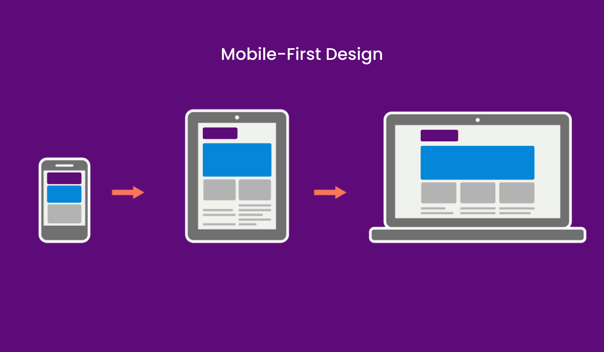
More than half of web traffic now comes from mobile devices. A website that is not optimized for mobile will quickly lose potential customers.
Mobile-first design ensures that websites work perfectly on smaller screens while maintaining usability.
A mobile-friendly website should include:
- Responsive layouts that adapt to screen sizes
- Touch-friendly buttons and navigation
- Easy-to-read text without zooming
- Optimized images and loading performance
Designing with mobile users in mind ensures that visitors have a consistent experience across all devices.
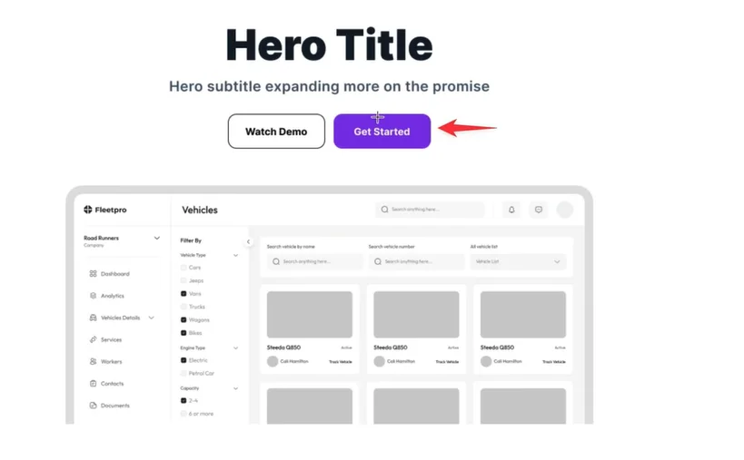
Clear Visual Hierarchy
A user-friendly website guides visitors naturally through its content. This is achieved through strong visual hierarchy.
Visual hierarchy helps users quickly understand what is most important on the page.
Design elements that contribute to visual hierarchy include:
- Headings and subheadings
- Strategic use of colors
- Spacing and layout structure
- Contrast between elements
For example, key actions like “Get Started” or “Book a Demo” should stand out clearly so users immediately know what step to take next.
Easy-to-Understand Content
Even the most beautiful design will fail if the content is confusing.
Modern websites use clear and concise language that communicates value quickly.
Effective content should:
- Focus on solving user problems
- Avoid unnecessary jargon
- Use short paragraphs and bullet points
- Highlight benefits rather than features
Users typically scan content instead of reading every word. Structuring content for quick readability helps them absorb information faster.
Consistent Design System
Consistency plays a major role in building trust and usability.
A consistent design system ensures that elements behave the same across the entire website.
This includes:
- Consistent color palette
- Standardized button styles
- Uniform typography
- Reusable design components
Consistency reduces cognitive load for users, making it easier for them to interact with the website.
Strong Calls-to-Action
A user-friendly website clearly guides visitors toward the next step.
Without clear calls-to-action, users may leave without taking any meaningful action.
Effective CTAs are:
- Visually distinct
- Action-oriented
- Placed strategically throughout the page
- Focused on one primary goal
Whether the goal is signing up, booking a call, or exploring services, clear CTAs improve conversions and user engagement.
Reliable Development and Scalability
Behind every smooth website experience is solid development.
Modern websites must be scalable, secure, and easy to maintain. Many startups today rely on modern frameworks and platforms such as webflow development services for startup usa to create fast, flexible websites that are easier to manage and scale as the business grows.
A well-built website ensures that performance, responsiveness, and functionality remain strong even as traffic increases.
Conclusion
Creating a truly user-friendly website requires more than good visuals. It involves thoughtful design, intuitive navigation, fast performance, and clear communication.
When these elements come together, websites become easier to use, more engaging, and far more effective at converting visitors into customers.
Businesses that invest in strong UX, modern development, and user-focused design are better positioned to grow online. Teams like The Small Square specialize in creating modern, high-performing digital experiences that help startups and businesses build websites users genuinely enjoy using.


Accepted Payments


