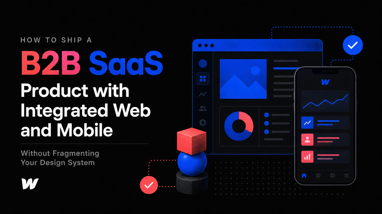
How to Ship a B2B SaaS Product with Integrated Web and Mobile Without Fragmenting Your Design System
The Design Fragmentation Problem
Most early-stage SaaS founders face a hard choice: build web first and retrofit mobile later, or split your design system between platforms from day one and watch your team spend half their time reconciling inconsistencies. Neither path is inevitable.
The real tension isn't web versus mobile—it's whether you architect your product with a unified design language from the start or inherit a fractured system the moment you add a second platform. When your team is under 20 people, fragmentation costs time you don't have and compounds every time you iterate.
Why Design Systems Break Across Platforms
A design system that works on web doesn't automatically translate to mobile. Constraints are different: touch targets expand, screen real estate shrinks, navigation patterns shift, and interaction timing changes. If you design for web first, mobile becomes a retrofit project—components need rebuilding, spacing rules flip, and your single source of truth splits into two conflicting versions.
By contrast, if you plan for both platforms simultaneously, you define core design principles that apply everywhere: button hierarchy, color usage, typography scale, spacing ratios. These principles stay consistent while their implementation adapts to each platform's native constraints.
How to Design Once, Ship Twice
The key is separating design intent from platform expression. Design intent is what a button does and why it looks like it does. Platform expression is how it appears on iOS, Android, web, or desktop.
Start by defining your core interaction patterns—not as static mockups, but as principles. How do users navigate? How do they input data? How do errors surface? What feedback confirms an action? These questions have answers that don't change between web and mobile; only the layout changes.
Document these patterns in a shared design system file. Use a tool that lets your team annotate spacing, colors, and type scales in one place—Figma works well for this, especially if you're using a framer website development company for interactive prototyping or building your design system itself in code.
Use Component-First Architecture
Treat every UI element as a component from day one. Buttons, cards, modals, forms, and navigation are built once and parameterized—color, size, state, and layout are props, not hardcoded variations. This discipline forces you to think platform-agnostic.
When your web team builds components in React or a webflow development agency builds them in Webflow, and your mobile team uses native SwiftUI or Kotlin, the structure is identical. A button takes the same props everywhere; only the rendering engine changes.
This approach also means you're not duplicating work. One design decision cascades to both platforms. One component update fixes both. Your design debt stays single, not double.
Platform-Specific Patterns Without Breaking Cohesion
Adapting to platform constraints doesn't mean abandonment. iOS has bottom tabs; web has top navigation. Mobile screens are portrait; web is landscape. Touchable areas must be 48x48px on mobile; mouse targets can be 32px on desktop. These aren't design failures—they're smart implementation.
The mistake is treating these as design system exceptions. Instead, treat them as intentional variants. Your design system should document why a pattern changes: "Navigation moves to bottom tab bar on mobile because thumbs naturally reach the lower third of the screen. On web, top navigation keeps related actions visible alongside content."
This keeps your team aligned. Everyone understands the principle; they just express it differently on each platform.
Prioritize Web for Initial Launch
If you have to sequence, start with web. Web reaches more users faster, moves toward product-market fit first, and gives you real usage data to inform mobile design. But build your design system for mobile from day one—don't wait.
Tools like Figma let you design responsive layouts that show how components reflow. A saas website development partner can help you build web in a framework that ports to mobile cleanly, whether you're using React Native, Flutter, or native platforms paired with a shared component library.
How Design and Development Stay in Sync
The biggest cause of design fragmentation isn't technical—it's communication. Designers hand off mockups; developers interpret them differently on web and mobile; a third person tries to retrofit consistency later.
Instead, involve developers in the design system design. Let them tell you which components are hard to build consistently. Build prototypes in code early—not just static mockups. If a dropdown interacts differently on web because of hover states, mobile because of long-press, and desktop because of keyboard navigation, document that in your component spec, not as a surprise during implementation.
Run design reviews before development sprints. Catch fragmentation before code is written. Early-stage teams can't afford to rebuild after launch.
Scaling Without Rewriting
As your SaaS grows, your design system becomes more valuable, not less. Teams add features; a strong system means they add them consistently. New platforms emerge; your system is the blueprint, not a puzzle to solve from scratch.
This is why The Small Square emphasizes cohesive product development for early-stage SaaS. Fragmented tools and teams create fragmented products. A unified design language, built intentionally across platforms from the start, compounds your competitive edge every quarter you operate.
The Real Payoff
Shipping web and mobile without fragmenting your design system means your team ships faster, makes fewer mistakes, and spends less time on rework. Users see a consistent product, which builds trust and reduces onboarding friction. By the time you're pushing toward product-market fit, your design system is an asset, not a liability.
Start with principle. Define intent. Build components. Document platform-specific expressions. Keep designers and developers talking. The extra effort upfront pays back every time you iterate.



Accepted Payments

