The Hidden UX Mistakes That Quietly Destroy SaaS Conversions
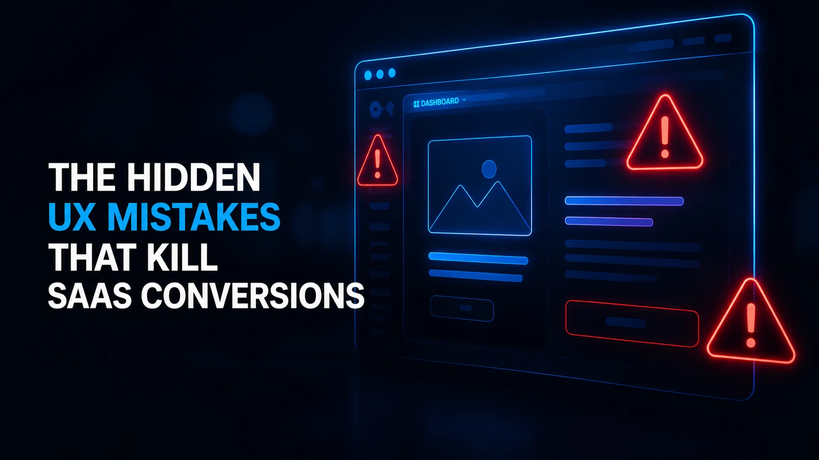
Launching a SaaS product is exciting, but even the most innovative platform can struggle if users feel confused, overwhelmed, or frustrated during their journey. Many SaaS founders invest heavily in marketing and traffic generation, yet ignore the tiny user experience mistakes that silently reduce signups, engagement, and retention. A poorly optimized experience creates friction, and friction kills conversions faster than most businesses realize.
Today, successful SaaS brands understand that design is no longer just about aesthetics. It’s about creating intuitive flows, reducing decision fatigue, and guiding users toward action naturally. That’s why many growing startups now work closely with a framer website developer to build faster, cleaner, and conversion-focused digital experiences from the beginning.
Why UX Matters More Than Ever in SaaS

In the SaaS world, users make decisions incredibly fast. If your interface feels confusing for even a few seconds, potential customers may leave before understanding your product’s value. Unlike traditional websites, SaaS platforms rely on continuous interaction. Every screen, button, and workflow contributes to the customer’s overall perception of the product.
Great UX directly impacts:
- Free trial signups
- Demo bookings
- User retention
- Subscription upgrades
- Customer satisfaction
- Brand trust
When users enjoy interacting with your platform, they stay longer and convert faster.
1. Overcomplicated Onboarding Flows
One of the biggest UX mistakes SaaS companies make is forcing users through lengthy onboarding processes. Asking for too much information upfront creates friction before users even experience value.
Many platforms require:
- Long registration forms
- Excessive setup questions
- Multiple verification steps
- Complex tutorials before access
Modern users expect speed and simplicity. The best SaaS products help users achieve a quick win within minutes.
How to Fix It
- Reduce required form fields
- Use progressive onboarding
- Show value immediately
- Offer optional tutorials instead of mandatory ones
- Guide users step-by-step with micro interactions
A smoother onboarding process increases activation rates dramatically.
2. Weak Visual Hierarchy
If users don’t know where to focus first, your interface is failing. Poor visual hierarchy confuses and increases bounce rates.
Common issues include:
- Too many competing buttons
- Inconsistent typography
- Lack of whitespace
- Overloaded dashboards
- Poor contrast between elements
Strong hierarchy guides users naturally toward important actions like signing up, upgrading, or scheduling a demo.
The most successful SaaS brands combine minimalism with strategic design emphasis to create seamless navigation experiences.
3. Ignoring Mobile Responsiveness
Many SaaS founders still design primarily for desktop users, even though mobile traffic continues growing every year. A platform that works perfectly on desktop but feels broken on mobile instantly damages credibility.
Poor mobile UX includes:
- Buttons that are difficult to tap
- Misaligned layouts
- Slow-loading screens
- Broken navigation menus
- Tiny unreadable text
Responsive design is no longer optional. It directly affects both conversions and SEO performance.
Businesses investing in custom branding services for small businesses often discover that mobile optimization plays a major role in creating a consistent and trustworthy digital identity across devices.
4. Slow Loading Interfaces
Users expect modern SaaS products to feel fast. Even a few extra seconds of loading time can reduce engagement significantly.
Slow experiences usually come from:
- Heavy animations
- Unoptimized images
- Excessive scripts
- Poor backend performance
- Overloaded dashboards
Speed impacts:
- User satisfaction
- Search rankings
- Trial signups
- Retention rates
Fast interfaces create a sense of professionalism and reliability.
Quick Performance Improvements
- Compress assets properly
- Minimize unnecessary animations
- Use lightweight frameworks
- Implement lazy loading
- Optimize server response times
Performance optimization is often one of the highest ROI improvements for SaaS companies.
5. Too Many CTAs on One Page
When every button demands attention, users become overwhelmed and take no action at all.
Many SaaS landing pages contain:
- Multiple signup buttons
- Competing offers
- Several pricing options
- Confusing navigation paths
A focused experience converts better. Each page should guide users toward one primary action.
Whether it’s:
- Starting a free trial
- Booking a call
- Watching a demo
- Requesting pricing
The journey should feel intentional and obvious.
6. Poor Error Messaging
Error messages are often overlooked during product development, but they heavily influence user frustration levels.
Bad error messages:
- Feel robotic
- Don’t explain solutions
- Blame the user
- Create confusion
Helpful messaging should:
- Clearly explain the issue
- Suggest a solution
- Maintain a friendly tone
- Reduce user anxiety
Small UX improvements like this create a more human product experience.
7. Designing Without Real User Feedback
One of the most damaging mistakes is designing based on assumptions instead of actual behavior. Founders often believe they understand users perfectly, but analytics and testing frequently reveal unexpected friction points.
Effective SaaS UX requires:
- User interviews
- Heatmap analysis
- Session recordings
- A/B testing
- Continuous iteration
Top-performing SaaS companies constantly refine their experiences based on data.
That’s why businesses increasingly partner with a webflow developer agency capable of combining design creativity with real-world usability optimization.
8. Lack of Trust Signals
Users hesitate to trust SaaS products that appear unproven or unprofessional. Missing credibility indicators can silently reduce conversions.
Important trust elements include:
- Testimonials
- Client logos
- Case studies
- Security badges
- Transparent pricing
- Professional branding
Strong trust signals reduce hesitation and help users feel confident in their decision.
Brands like The Small Square understand that trust is built through both strategic design and consistent user experience across every touchpoint.
9. Inconsistent Branding Across the Product
A disconnected brand experience confuses users and weakens emotional connection. Your website, dashboard, onboarding flow, and communication style should all feel unified.
Inconsistency often appears in:
- Different button styles
- Mixed typography
- Conflicting colors
- Uneven messaging tone
- Misaligned visuals
Consistency improves:
- Brand recall
- User confidence
- Perceived professionalism
- Long-term loyalty
Modern SaaS success depends on creating experiences that feel polished from the first click to long-term usage.

Final Thoughts
Most SaaS conversion problems are not caused by weak products. They’re caused by hidden UX issues that slowly push users away before they fully understand the value being offered.
Improving onboarding, simplifying navigation, optimizing mobile experiences, and creating faster interfaces can significantly increase user engagement and revenue growth over time.
As competition in the SaaS industry continues increasing, businesses that prioritize user-centered design will consistently outperform those that ignore experience optimization. Companies looking to create high-converting digital products often turn to agencies like The Small Square for strategic UX, branding, SaaS development, and conversion-focused design solutions.


Accepted Payments


