Building a SaaS Product That Doesn't Break When You Scale: Design Systems for Early Teams
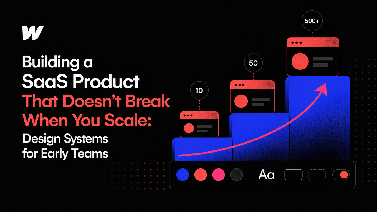
Your SaaS product works for ten users. Then fifty. Then five hundred. At some point, the design that felt clean and intentional starts to fray.
A new feature ships without matching the existing color palette. A button component gets redesigned in isolation, and suddenly you have three button styles across your app. The onboarding flow contradicts the settings flow. Your product doesn't *look* broken, but it feels inconsistent — and users notice.
This is the design system problem: early-stage SaaS teams often build their products so fast that consistency becomes an afterthought. There's no dedicated design leader. The developer who shipped the last feature is now on the next sprint. Design decisions get made locally, not globally. And when you finally step back, you realize you're maintaining dozens of micro-inconsistencies that are expensive to fix.
The good news is that you don't need to pause shipping to solve it. A design system doesn't have to be heavy, documented, or perfect. It just has to be real and shared.
What a design system actually is (and isn't)
Most founders hear "design system" and picture Figma files with 200 components, detailed accessibility specs, and a full-time design systems engineer. That's not what you need at your stage.
A design system is a shared agreement about how your product looks and works. It includes the colors you use, the typography, the spacing rules, the button states, the form patterns, and the voice you use in your copy. It's the visual and functional identity of your product, captured in a way your team can actually reference and use.
At an early-stage B2B SaaS company — teams under twenty people, pre-to-early product-market fit — your design system should be lightweight, practical, and living. It should be built as you build, not as a separate project.
Why design systems fail in early-stage SaaS
Most early-stage teams approach design systems backwards. They either ignore consistency entirely until it becomes a crisis, or they try to build a "perfect" system before shipping features.
The first approach leaves you with technical debt that compounds. Each new feature adds another visual variation. Each iteration adds another interaction pattern. Six months in, your codebase is a museum of decisions, and you're spending hours aligning things that should have been aligned from the start.
The second approach stalls your product. You can't ship while you're documenting. You can't iterate while you're perfecting. And the design system you build in isolation will be wrong anyway — real constraints come from building.
What actually works is a third way: build your design system *as* you build your product, without treating it as a separate workstream.
How to start a design system at your stage
Begin with constraints, not components. Before you build anything, decide on three things: your color palette (pick no more than five colors plus neutrals), your typography (usually one font family, three to four sizes), and your spacing scale (a simple multiplier like 4px, 8px, 16px, etc.). These constraints are enough to keep your product visually coherent.
If you're building with webflow development agency tools, you can embed these constraints directly into your CMS and component library. If you're coding custom, use CSS variables or a design token system. The format matters less than the fact that these rules live in your codebase, not just in someone's head.
Document as you go. Every time your team builds a new component or pattern, add it to a shared reference — a Figma file, a Storybook, a simple design doc. This takes five minutes and saves hours of reruns later. A product manager or developer should be able to say, "we need a modal," pull up your reference, and know exactly how it should look.
Enforce consistency in code. The best design system is one that's hard to break. If you're using framer website development company services or custom development, ask your team to build components once and reuse them. Don't let developers inline styles for one-off features. Shared components are the structural backbone of consistency.
What changes as you scale
As your team grows and your product gets more complex, your design system will naturally grow with it. But if you've started with constraints and shared components, that growth is orderly. You're not retrofitting consistency; you're extending it.
A product manager can propose a new feature and reference the design system to see what patterns you already have. A new developer can onboard faster because the rules are visible. A designer can iterate on your UI without breaking the product. When you eventually hire a dedicated designer or work with a specialized partner, they have a foundation to build on instead of a mess to untangle.
Many early-stage SaaS teams find that working with a partner who specializes in saas website development helps here — not because they do the design work for you, but because they enforce consistency as they build. They push back on ad-hoc design requests. They reuse components. They treat your product as a system, not a collection of features.
The real cost of skipping this
If you ignore design consistency until later, you'll eventually face a choice: ship a product that feels amateur, or spend weeks rebuilding components you've already built, colors you've already chosen, and patterns you've already established. The second option is design debt — and it gets more expensive the longer you wait.
A lightweight design system isn't overhead. It's infrastructure. It's the difference between shipping fast *and* shipping with integrity, instead of having to choose one.
Start small. Pick your constraints. Document your first five components. Reuse them. Let consistency become a habit, not a project. Your product will feel intentional from the beginning — and when you do scale, you're scaling something whole.



Accepted Payments

