Building a SaaS Product Across Web and Mobile: When to Choose Unified Design Over Separate Teams
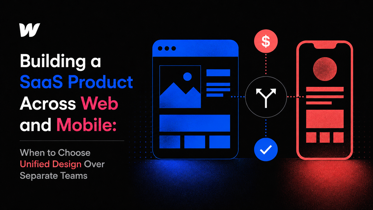
The Hidden Cost of Splitting Web and Mobile Development
Most early-stage SaaS founders approach web and mobile as two separate projects. They hire one team for the web app, another for iOS or Android, and hope consistency somehow emerges. It rarely does. The result is duplicated effort, inconsistent user experiences, and a product that feels pieced together rather than intentional.
Building SaaS across both platforms forces a real choice: fragment your design and development across multiple vendors, or architect your product from the ground up as a unified system. The second path costs less, launches faster, and produces a product users actually recognize across devices.
The Unified Design System Approach
A unified design system means building once, deploying twice. Instead of designing a web dashboard and then redesigning that same experience for mobile, you define core design principles, components, and user flows once—then adapt them thoughtfully for each platform's constraints.
This doesn't mean your mobile app looks identical to your web product. It means users encounter the same language, the same interaction patterns, and the same visual hierarchy. A modal in your web app might become a bottom sheet on mobile, but the intent and behavior remain consistent. A data table becomes a stacked card layout. The underlying logic stays intact.
Early-stage SaaS teams with 5 to 15 people don't have room for inconsistency. You're competing on speed and polish. A single design system cuts development time in half because developers aren't reinterpreting design intent across platforms—they're implementing a shared specification.
Why Separate Teams Break Your Product
When web and mobile development live in different codebases, with different teams, under different timelines, drift becomes inevitable. A feature ships on web. Mobile follows three weeks later with subtle differences. A bug fix on iOS doesn't make it to Android for a month. Users notice. More importantly, your team spends cycles reconciling differences instead of building forward.
This friction multiplies when design changes. Say you test a new onboarding flow on web and it improves activation by 20%. Communicating that insight to your mobile team, redesigning for mobile constraints, and shipping it again takes weeks. A unified team ships it once.
Cost compounds too. Two separate teams means two separate communication overhead, two separate design reviews, two separate QA processes. For founders bootstrapped or early in fundraising, this overhead is often invisible until the bill arrives.
Choosing the Right Technology Stack for Unified Development
Not all tech stacks support unified design thinking equally. Your choice matters enormously.
Web-first with responsive design: Build your core product as a responsive web application using modern frameworks (React, Vue, Next.js). Then, if mobile-specific behavior is critical, layer a native mobile experience on top. This works well for SaaS products where the desktop experience dominates and mobile is secondary—think project management tools, analytics dashboards, or admin panels.
No-code and low-code platforms: Tools like webflow development agency solutions let you design and deploy responsive web experiences without managing a custom codebase. This eliminates a huge category of implementation variance. Developers build once; the platform renders responsively. It's fast and keeps design intention intact. The trade-off: customization limits and vendor dependency.
Modern design tools with code generation: Platforms like framer website development company solutions bridge design and code, letting designers hand off components directly to developers with minimal interpretation loss. This doesn't magically solve mobile deployment, but it reduces the design-to-development gap significantly.
Dedicated mobile frameworks: React Native and Flutter let you write once and deploy to both iOS and Android from a shared codebase. This is powerful for product-heavy SaaS where mobile is equally important to web. The catch: both require specialized developer expertise, and the user experience often feels compromised on one platform or the other—these frameworks are fastest when you accept some platform-specific quirks.
The Unified Approach in Practice
Early-stage SaaS teams that win typically follow this pattern: define your product's core flows and information architecture once. Design the experience for desktop first (where detailed work happens), then thoughtfully adapt it for mobile (where quick checks and light edits happen). Build your web product with responsive principles baked in. If native mobile is essential, hire specialists to build the mobile app, but require them to use your design system and implement the same flows.
The Small Square works with B2B SaaS teams under 20 people exactly this way. They offer saas website development services that start from a unified design perspective, then branch into platform-specific implementation. This means your founding team doesn't manage two separate design conversations—you manage one vision that ships across platforms.
This approach assumes you've already validated product-market fit on at least one platform. If you're still exploring what users actually need, building for web first is smarter. Once you know your core users and their workflows, expanding to mobile with a unified design system feels natural instead of chaotic.
Timing: When to Actually Build Mobile
Many founders ship mobile too early. The temptation is real: "Our users will love having this on their phone." Often, they won't use it. B2B SaaS users often do deliberate work on desktop—complex workflows, data entry, configuration—and mobile serves a specific secondary use case: status checks, quick approvals, notifications.
Build mobile when: (1) you have clear evidence of a specific mobile use case your users need, (2) your web product is stable enough that replicating its behavior is straightforward, and (3) you're not diverting resources from core product improvements.
Until then, a responsive web design that works on tablets and phones keeps your options open without the overhead of separate mobile teams. It's not ideal for native feel, but it keeps you moving.
Conclusion: Unified Design Wins Early
For early-stage SaaS founders building across web and mobile, unified design isn't a nice-to-have—it's a prerequisite for moving at startup speed. One design system, adapted thoughtfully for each platform, costs less, launches faster, and produces a product users recognize. Fragmented teams and separate codebases guarantee duplicated work and inconsistency you can't afford.
Start with a single compelling platform (web or mobile), design it as a complete system, and expand only when you have proof that users need the other platform. When you do expand, require the same design discipline you used to build the first one. That discipline is what separates products that feel coherent from products that feel like a collection of half-finished apps.



Accepted Payments

