Advanced UX Strategies to Increase SaaS Conversions (2026)
More traffic is not the answer. Most SaaS products already have enough visitors. What they lack is a user experience that actually converts.
88% of users won’t return after a bad experience.
Strong UX can drive up to 2.3x more revenue.
You have less than 8 seconds to show value before users drop.
Your SaaS product might be excellent. Your pricing could be fair, your positioning strong, and your engineering solid. Still, conversions can fail — because a user enters your onboarding, gets confused, and quietly leaves.
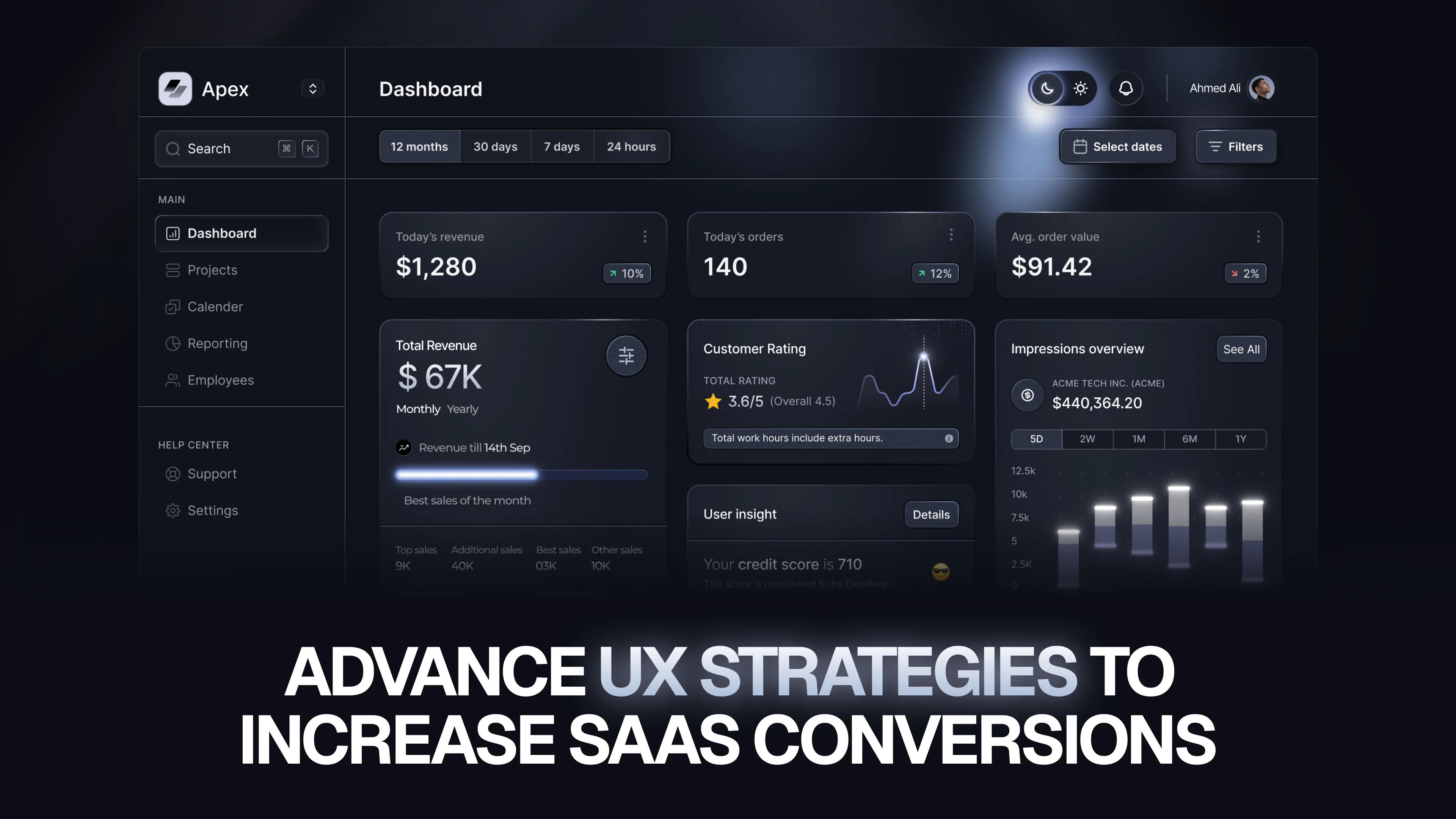
UX is not just design. It’s how your product communicates value.
At Social Revup, we’ve seen one consistent pattern: conversion problems are rarely about visuals — they’re about structure, flow, and clarity.
Why Most SaaS UX Fails at the Conversion Moment
Most SaaS UX failures follow the same pattern.
A clean, modern design is created. It looks great in Figma. It launches. But conversions don’t improve.
The problem?
The design is based on assumptions, not user behavior.
In one case, we analyzed a B2B SaaS onboarding flow where 60% of users dropped at a settings screen. The team saw it as optional. Users saw it as a blocker.
Once moved later in the journey, conversion improved by 18% within weeks.
What to Do Instead
Before designing anything, focus on behavior:
- Use session recordings (Hotjar, FullStory) to observe real users
- Run funnel analysis (Mixpanel, PostHog) to identify exact drop-off points
- Conduct user interviews with churned users
At Social Revup, every UX project starts with data — not design opinions.
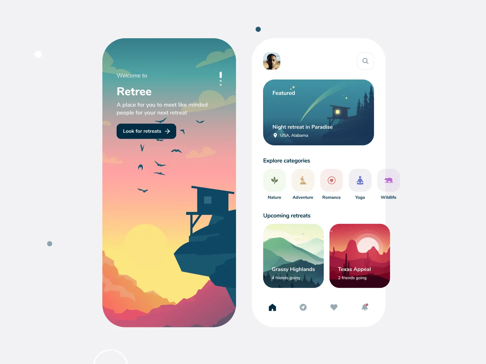
Onboarding: The Most Expensive UX Problem in SaaS
Onboarding is where most users are lost — and where improvements deliver the highest ROI.
The biggest mistake?
Trying to show everything before users experience anything.
Users don’t want a tour. They want results.
The Aha Moment Framework
The “aha moment” is when users first feel your product’s value.
- In Slack: sending a message and getting a reply
- In Notion: creating and seeing content instantly
- In Stripe: receiving a test payment
Your onboarding should focus on one goal:
Get users to that moment as fast as possible.
High vs Low Performance Onboarding
Bad Flow:
- Welcome screen
- Invite team
- Integrations
- Settings
- Billing
→ User drops
High-Converting Flow:
- Perform core action immediately
- Show instant result
- Add optional steps later
If a step doesn’t lead to value — remove it.
Cognitive Load: The Silent Conversion Killer
Cognitive load is the mental effort required to use your product.
Too many choices, unclear labels, or cluttered interfaces increase friction — and users leave without deciding.
Why It Matters
This is especially critical on:
- Pricing pages
- Signup flows
- Dashboards
Hick’s Law in SaaS
More choices = slower decisions.
Example:
Low Conversion:
5 pricing plans, dozens of features → confusion
High Conversion:
3 clear plans with key benefits → faster decisions
How to Reduce Cognitive Load
- Use one primary CTA per screen
- Maintain clear visual hierarchy
- Use whitespace strategically
- Keep interactions consistent
Form Design: Where Conversions Quietly Die
Forms are your direct conversion point — and often overloaded.
Most SaaS forms ask for unnecessary data upfront.
Users don’t care about your data needs. They care about getting started.
Golden Rule
Only ask for what’s required to deliver initial value.
Optimized Signup Example
Low Conversion Form:
- Name
- Company
- Phone
- Job Title
- etc.
High Conversion Form:
- Password
→ Start free trial
Key Improvements
- Inline validation
- Mobile-friendly single-field focus
- Smart defaults
- Progress indicators
CTA Strategy: Where Most SaaS Products Go Wrong
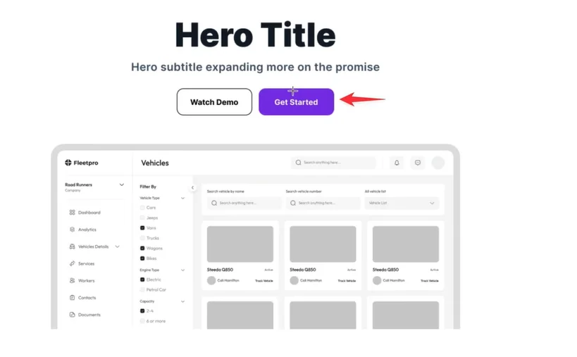
CTAs often fail because they are:
- Hidden
- Too generic
Your CTA is not a button. It’s your conversion trigger.
Placement Rules
- Above the fold on high-intent pages
- Repeated at decision points
- Visually dominant
High-Converting CTA Examples
Weak
Strong
Submit
Create my account
Learn More
See how it works
Sign Up
Start your free trial
The biggest improvement we consistently see:
Replacing “Submit” with outcome-driven language.
Social Proof That Actually Converts
.webp)
Users trust users more than marketing copy.
But placement matters more than presence.
High-Impact Placement
- Next to CTAs
- On pricing pages
Low Impact
- Footer
- About page
Strongest Types of Social Proof
- Case studies with real numbers
- Video testimonials
- Named reviews with roles
- Usage stats
- Brand logos
Weak testimonials reduce trust — avoid them.
Micro-Interactions: Small Details, Big Impact
Micro-interactions are small UI responses that build trust.
Examples:
- Loading indicators
- Success messages
- Error feedback
Without them → uncertainty
With them → confidence
Example
Without Feedback:
User clicks save → nothing happens → confusion
With Feedback:
Spinner → “Saving…” → success message
→ clear confirmation
Priority Areas
- Form states (loading, success, error)
- Button feedback
- Empty states with guidance
- Clear error messages
Testing & Iteration: The Real Growth Engine
UX is not a one-time task. It’s an ongoing process.
Small improvements compound over time.
What to Test First
- Onboarding flow
- CTA copy & placement
- Pricing structure
- Form fields
- Homepage messaging
How to Test Without Big Tools
- Change one variable at a time
- Run tests for at least 2 weeks
- Define one success metric
- Document everything
Not every result is meaningful — validate with enough data.
Final Thought
Better UX doesn’t just improve design — it improves revenue.
You don’t need more traffic.
You need a clearer path to value.
At The Small Square, we focus on fixing the exact points where users hesitate, drop, or lose clarity — because that’s where conversions are won or lost.


Accepted Payments


