This Tool Makes UI Effects Insane – Shaders in Paper.design
UI design trends change fast, especially on platforms like Twitter (X). Recently, a very simple but visually striking UI effect has been getting massive traction. Surprisingly, these posts are not coming from big design influencers only. Even small accounts with limited followers are getting hundreds or even thousands of likes using nothing more than a clean background, a circular element, and shader-based effects.
The best part is that creating these effects does not require advanced design skills or years of experience with tools like Figma. In this blog, I will walk you through how these viral UI visuals are created using Paper.design, a lightweight design tool that focuses on visual effects and shaders.
Why These Simple UI Posts Are Going Viral on X
If you look closely at trending UI posts, most of them follow a similar pattern. A soft background, a rounded container, a circular icon with gradients, and subtle animated effects. These visuals look futuristic, premium, and polished, which naturally attracts attention while scrolling.
What makes this trend even more interesting is that the complexity is extremely low. There is no heavy layout work, no complex grids, and no advanced prototyping involved. The focus is entirely on shaders, textures, and visual depth.
What Is Paper.design and Why Designers Are Using It
Paper.design is a browser-based design tool that allows you to experiment with shaders, gradients, and animated visual effects quickly. It is not meant to replace Figma or professional UI tools, but it shines when it comes to creating eye-catching visuals for social media.
With Paper.design, you can apply liquid metal shaders, noise effects, pulsing borders, and gradients with just a few clicks. This makes it perfect for designers, creators, and even non-designers who want to create high-engagement visuals.
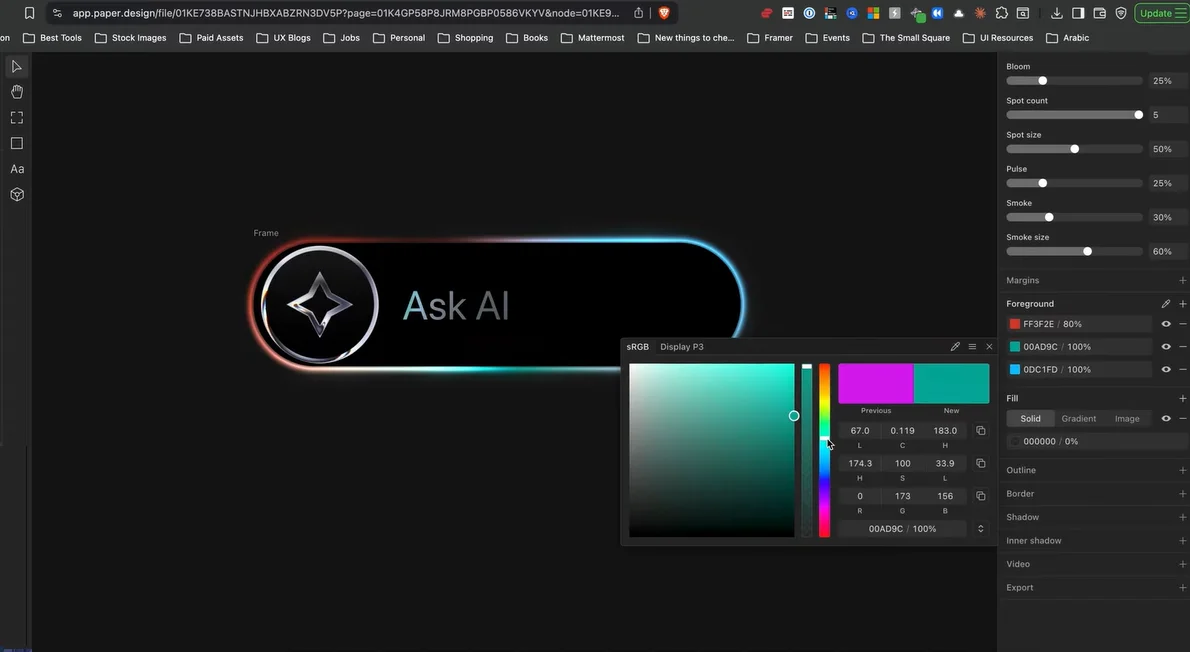
Creating the Base UI Layout in Paper.design
The first step is building a simple base layout. Start by drawing a rectangle and adding rounded corners to it. This rectangle will act as your main container. Choose a darker background color to give your design more contrast and depth.
Next, duplicate this rectangle and slightly reduce its size. Place it inside the main container and align it properly. This layering instantly adds dimension to your UI without any complex effort.
Designing the Circular Element for the Icon
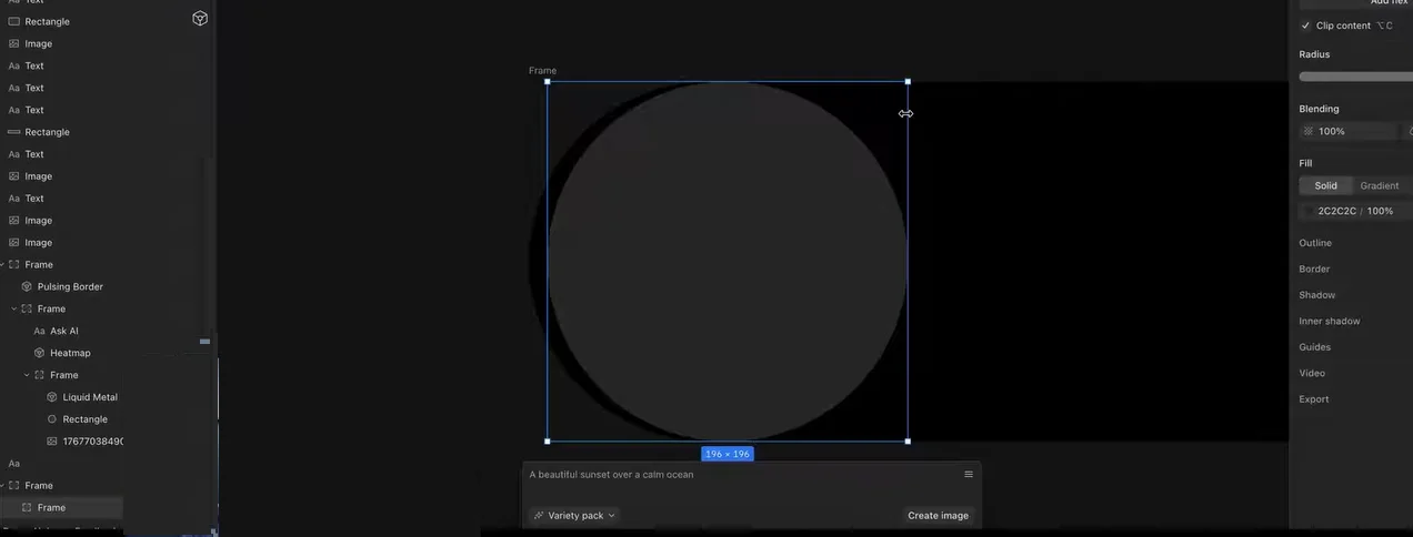
Inside the container, add a circular shape by setting equal height and width values. Position it on the left side of the container. This circle will later hold the icon and shader effects.
At this stage, your design will look very minimal, but this is exactly what you want. The magic comes from shaders, not layout complexity.
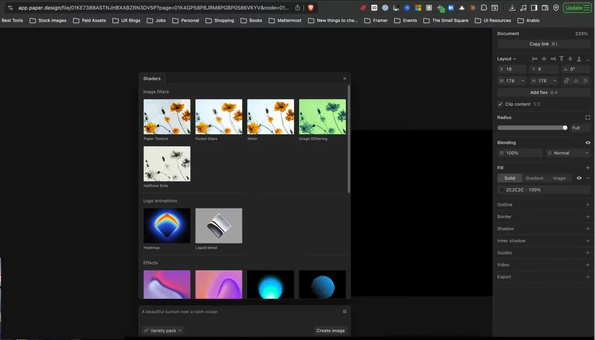
Applying Liquid Metal Shaders for a Premium Look
Paper.design offers built-in shaders that can completely transform a simple shape. Select the liquid metal shader and apply it to the circular element. Remove any unwanted background by adjusting opacity and make sure the shader is clipped perfectly inside the circle.
To enhance the effect, add a subtle gradient overlay. A lighter gray tone at the top and a darker tone at the bottom works well. This creates a realistic metallic feel that looks both modern and high-end.
Adding and Styling the Sparkle Icon
Now choose an icon, such as a sparkle, from any icon library like Remix Icons. Import the SVG into Paper.design and place it inside the circular element.
If you want to take it a step further, you can apply the liquid metal shader directly to the icon itself. Simply duplicate the shader layer, place it below the SVG, and assign the icon shape to it. This makes the icon blend beautifully with the rest of the design.
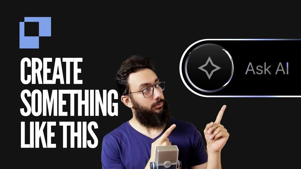
Creating the “Ask AI” Text Effect
Text effects are what make these UI visuals stand out. Add text like “Ask AI” next to the circular element and increase its font size slightly so it feels balanced.
To enhance the text, apply a noise or neuron-style shader effect. By adjusting blending modes like multiply and tweaking brightness and scale, the text starts to feel alive instead of flat. Small color adjustments can dramatically improve visibility and overall aesthetics.
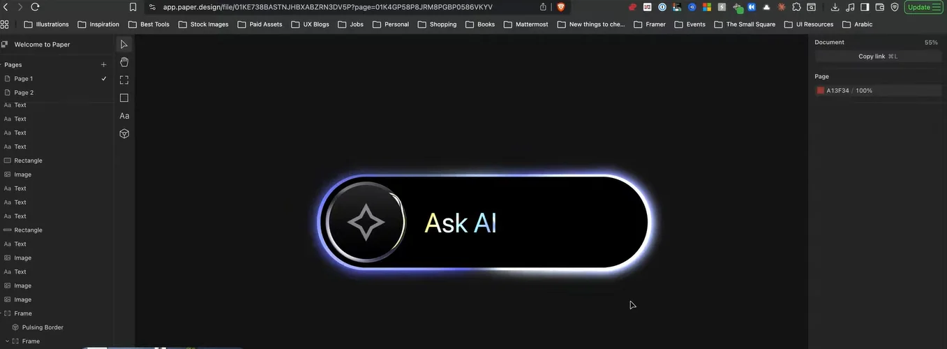
Enhancing the Design with Animated Border Effects
To make the UI even more dynamic, add a pulsing border effect around the main container. Set the roundness to match the container shape and remove any background fill so only the animated border remains.
You can customize the border color to match your overall theme, such as soft blues or subtle gradients. This adds motion and depth without overwhelming the design.
Final Tweaks and Visual Balance
Once all elements are in place, spend some time adjusting scale, spacing, and positioning. Small changes in size or alignment can significantly improve how polished the final design looks.
You can also tweak shader properties like repetition, angle, and brightness to create variations. This allows you to create multiple unique visuals using the same basic structure.
Why This Approach Works So Well
The reason these designs perform well on social media is simple. They look advanced, futuristic, and premium, yet they are extremely easy to create. The same visual principles are now widely used in saas website design services to improve user engagement and brand perception.
Paper.design makes it possible to achieve these effects quickly, even if you are not a professional UI designer.
Final Thoughts
If you want to create viral UI visuals, experiment with shaders, keep layouts minimal, and focus on depth and motion rather than complexity. Tools like Paper.design make this process fast, fun, and accessible for everyone.
If you are exploring modern UI trends, visual experimentation, or creative design workflows, you can find more insights and resources at The Small Square.


Accepted Payments


