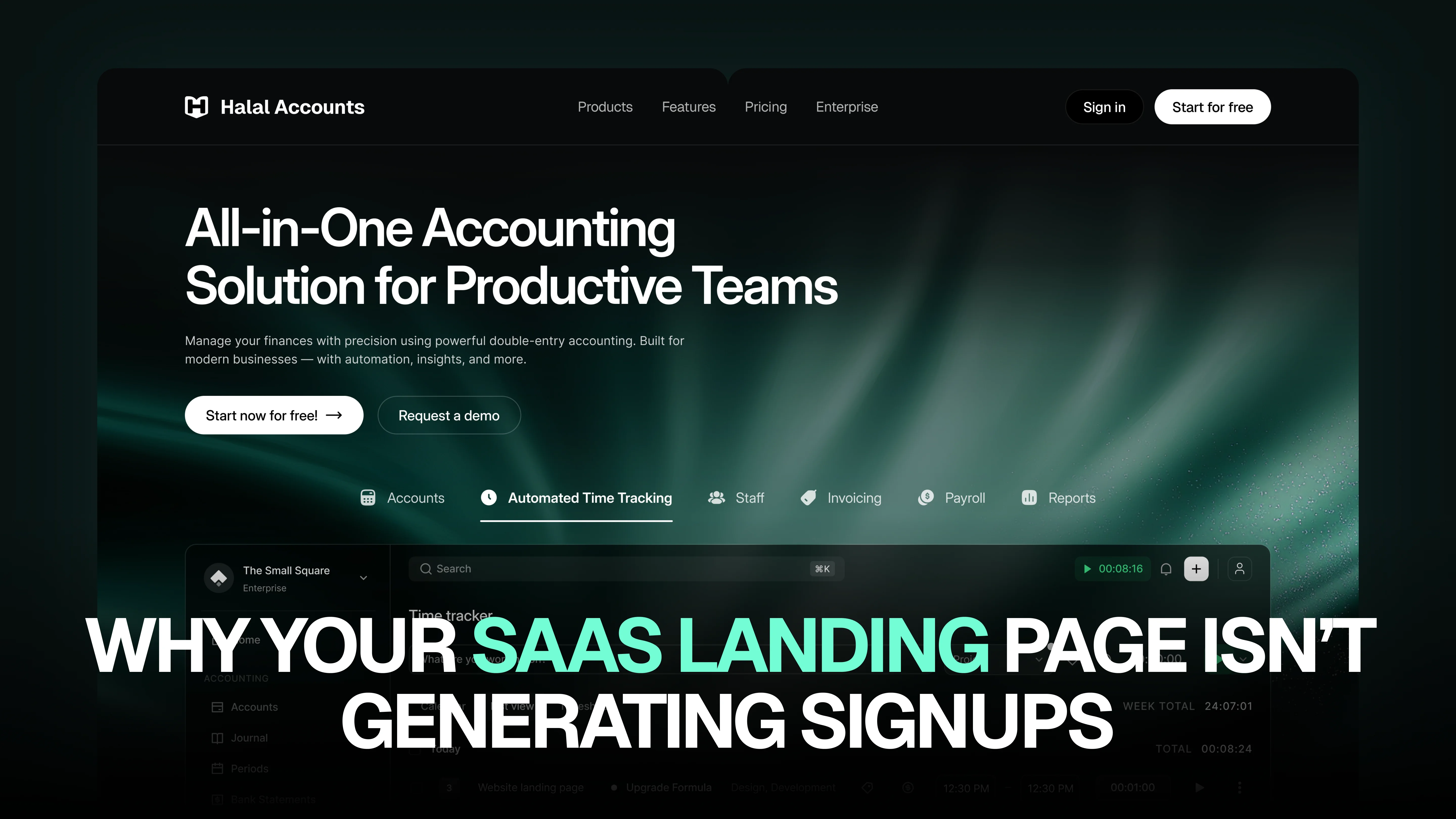
Why Your SaaS Landing Page Isn’t Generating Signups
You’re driving traffic. Your ads are running. SEO is bringing visitors. Yet your SaaS landing page isn’t converting. No signups. No demo requests. No trial activations.
If this sounds familiar, you’re not alone.
Many SaaS businesses struggle with conversion rates—not because their product is bad, but because their landing page fails to communicate value effectively. A SaaS landing page isn’t just about design. It’s about clarity, psychology, positioning, and trust.
Let’s break down the real reasons your SaaS landing page isn’t generating signups—and how to fix them.
1. Your Value Proposition Isn’t Clear Enough
Visitors decide within seconds whether to stay or leave. If your headline is vague, clever, or too technical, users won’t understand what your product actually does.
Bad example:
“Revolutionizing Digital Workflow Synergy”
Good example:
“Project Management Software for Remote Teams That Cuts Deadlines by 30%”
Your headline must answer three questions instantly:
- What is this?
- Who is it for?
- Why should I care?
Clarity converts. Cleverness confuses.
2. You’re Talking About Features Instead of Outcomes
Most SaaS landing pages list features:
- AI-powered dashboard
- Real-time analytics
- Automated workflows
But users don’t buy features. They buy outcomes.
Instead of saying:
“Advanced reporting dashboard”
Say:
“Track performance in real time and make faster decisions without spreadsheets.”
Shift your messaging from “what it does” to “what it changes for the user.”
3. Weak or Confusing Call-to-Action (CTA)
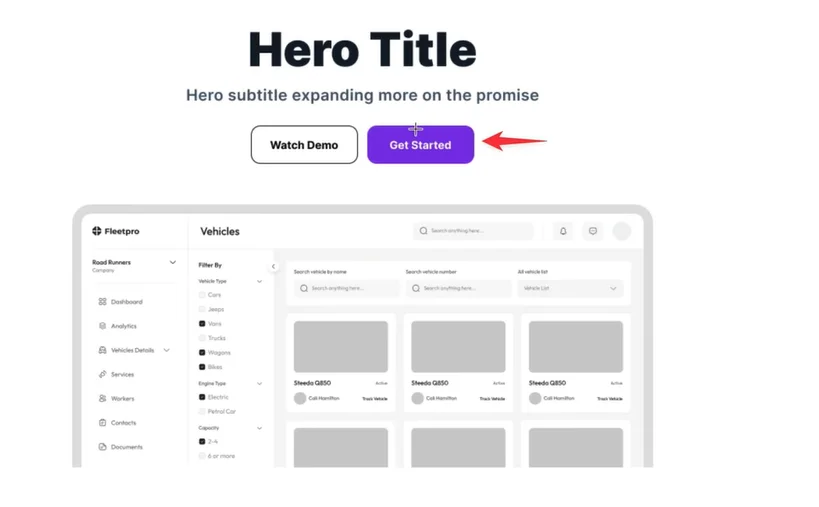
Your CTA should be:
- Clear
- Benefit-driven
- Easy to understand
Avoid generic buttons like:
- Submit
- Learn More
- Click Here
Instead use:
- Start Free Trial
- Get My Demo
- Try It Free for 14 Days
Also, remove friction. If you’re asking for too much information upfront, users will bounce. Keep forms short. The easier it is to start, the higher your signup rate.
4. No Trust Signals = No Conversions
People don’t trust new software easily.
If your landing page lacks:
- Testimonials
- Case studies
- Client logos
- Reviews
- Security badges
Then users hesitate.
Social proof reduces risk. Even one strong testimonial explaining a measurable result can significantly increase conversions.
For example:
“We reduced onboarding time by 42% in just 3 months.”
Specific results build credibility.
5. Poor Page Structure and Flow
A high-converting SaaS landing page follows a psychological structure:
- Clear headline
- Supporting subheadline
- Visual explanation (product screenshot/video)
- Benefits section
- Social proof
- Feature highlights
- FAQs
- Strong final CTA
If your page feels cluttered or unstructured, users get overwhelmed and leave.
Whitespace, scannable sections, and clear hierarchy make a huge difference.
6. You’re Not Addressing Objections
Every visitor has silent objections:
- Is this worth the price?
- Will it integrate with my tools?
- Is it secure?
- Is onboarding complicated?
If your landing page doesn’t proactively answer these concerns, users won’t sign up.
Add an FAQ section that directly handles objections. The more confident users feel, the more likely they convert.
7. Slow Loading Speed
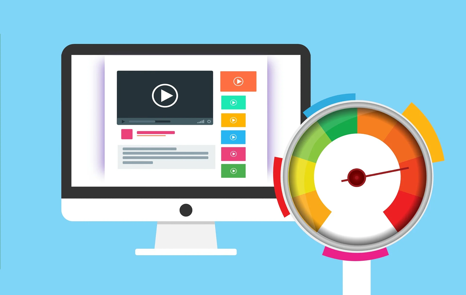
Speed directly affects conversions.
If your landing page takes more than 3 seconds to load, you’re losing potential customers. Heavy images, unnecessary scripts, and poor hosting can kill performance.
Optimize:
- Image sizes
- Code
- Server performance
- Mobile responsiveness
Remember, most SaaS traffic now comes from mobile devices.
8. Weak Product Positioning
Sometimes the issue isn’t the design—it’s positioning.
If your SaaS sounds like “another tool,” users won’t care.
You must clearly differentiate:
- Who you are for
- Who you are NOT for
- Why you are different
Strong positioning makes your product feel specific and intentional.
For example:
“Accounting software for freelancers”
is far stronger than
“Modern accounting platform.”
Specific beats generic every time.
9. No Strategic Development Behind the Page
Many founders design landing pages based on guesswork. But high-converting SaaS pages are built strategically—based on user behavior, competitor analysis, and conversion research.
This is where working with a professional saas development agency can make a real difference. When landing pages are designed with both user experience and business goals in mind, conversion rates improve dramatically. It’s not just about how the page looks—it’s about how it performs.
10. You’re Not Testing Anything
If you launch your landing page and never test it, you’re leaving money on the table.
Test:
- Headlines
- CTA wording
- Button colors
- Pricing presentation
- Page layout
Even small changes can lead to big improvements in signup rates.
Data should guide decisions—not assumptions.
Final Thoughts
If your SaaS landing page isn’t generating signups, the problem is rarely traffic alone. It’s usually messaging, clarity, structure, or trust.
A high-converting SaaS landing page:
- Communicates value instantly
- Focuses on outcomes
- Builds credibility
- Removes friction
- Guides users naturally toward action
Instead of redesigning randomly, audit your page strategically. Identify friction points. Improve clarity. Strengthen positioning. Add proof. Optimize speed.
When your landing page clearly communicates why your product matters—and makes it easy to get started the small square signups stop being a struggle and start becoming predictable.


Accepted Payments


