High-Converting Landing Page Structure That Actually Works
A high-converting landing page isn’t just about good visuals — it’s about structure, clarity, and conversion-focused web design development services. While design trends dominate platforms like Twitter and Dribbble, very few people actually focus on what drives conversions.
In this guide, we’ll break down the proven structure of a landing page that converts — whether your goal is signups, demos, purchases, or leads.

1. Header: Navigation That Supports Conversions
The header is the first functional element users interact with. It should include:
- Your logo
- Key links (Features, Pricing, Solutions, Contact)
- A clear primary CTA
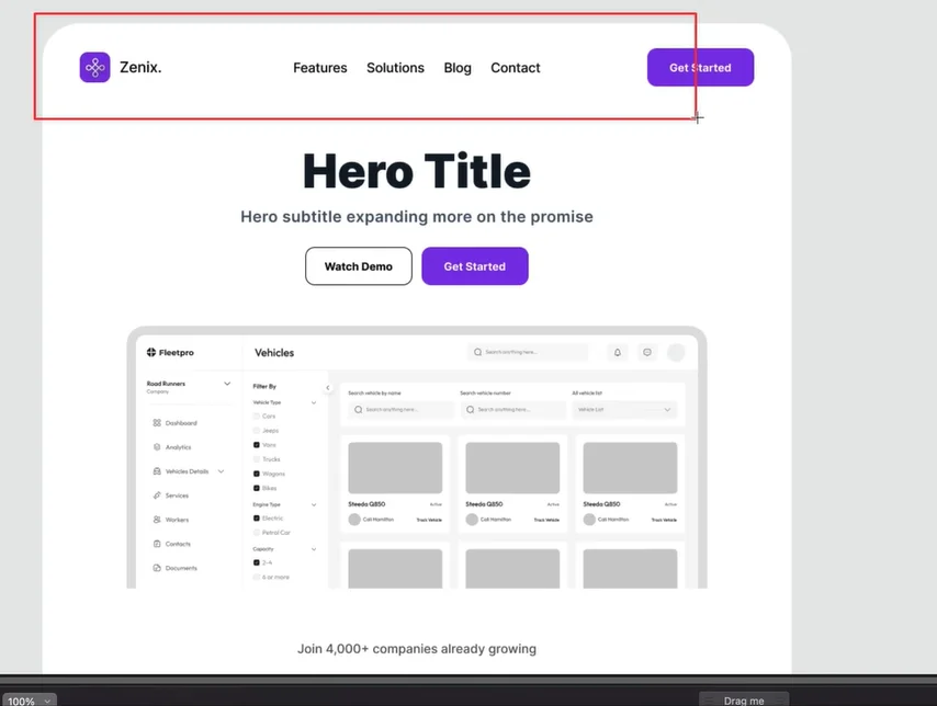
Why a Fixed Header Matters
A sticky (fixed) header keeps your CTA visible as users scroll. This removes friction and makes it easier for users to take action at any time.
Dropdown menus can also be used if you have multiple features or solutions, keeping the layout clean while still accessible.
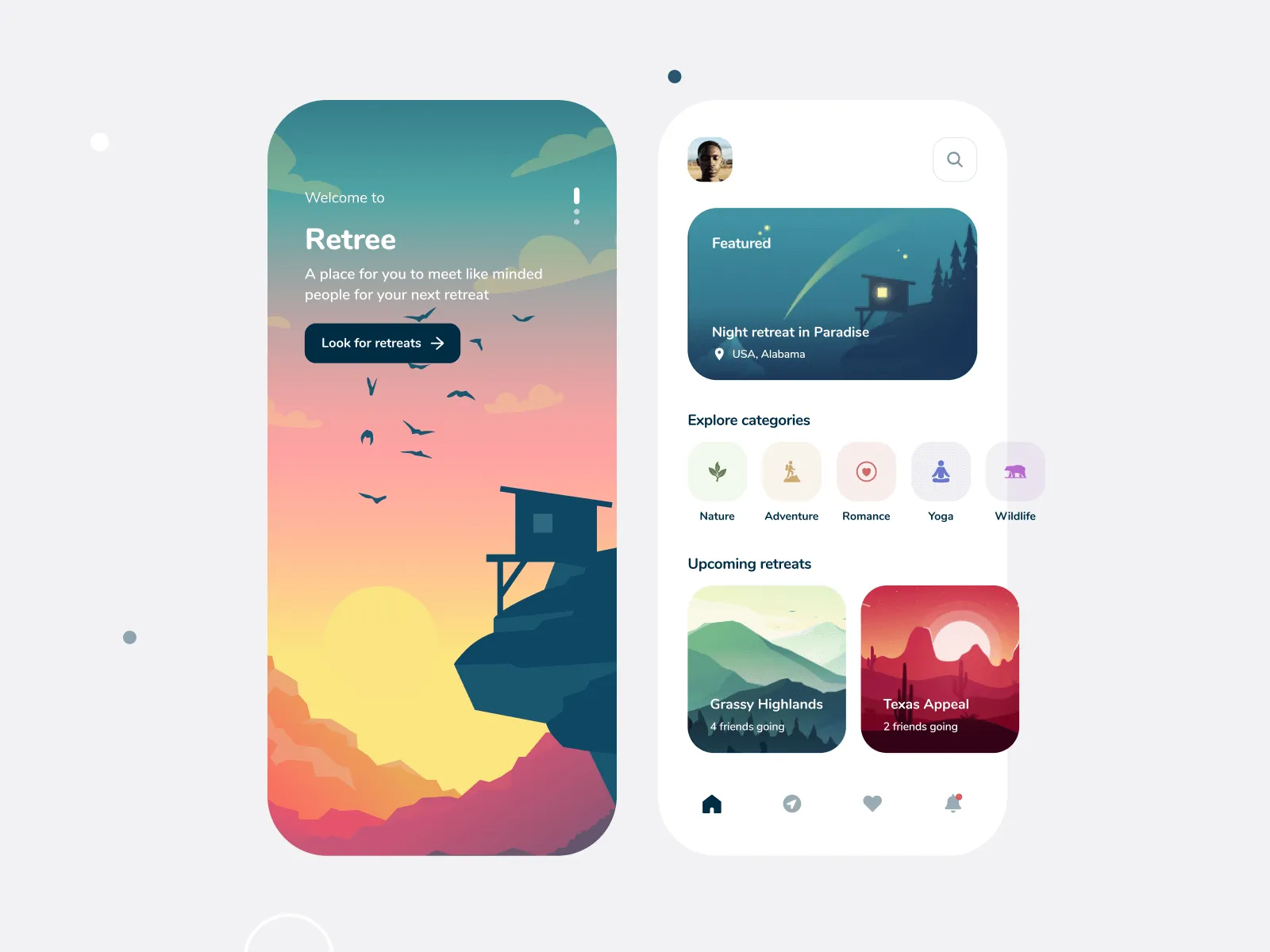
2. Hero Section: Where First Impressions Happen
You have 5 seconds or less to capture attention. The hero section determines whether users stay or leave.
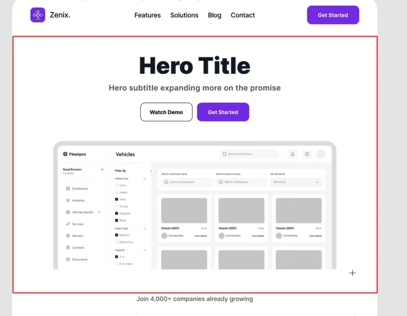
Headline: Be Clear and Benefit-Driven
Your headline should immediately communicate value or remove a pain point.
“The Best Project Management Tool”
“Organize Your Sales Pipeline in Half the Time”
Think of the headline as a hook, not a label.
Sub-Headline: Expand the Promise
Use the sub-headline to explain how the benefit is delivered.
Example:
Save 10+ hours weekly with automation and AI-powered insights.
3. Call to Action (CTA): Make It Obvious
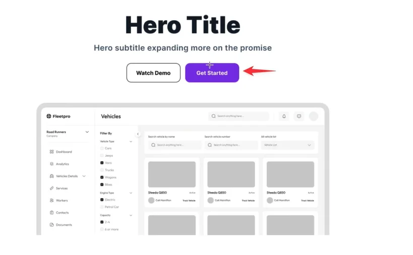
Your CTA should be:
- Bold
- Highly visible
- Action-oriented
Avoid subtle buttons or vague text like “Learn More”.
Strong CTAs include:
- Start Free Trial
- Book a Demo
- Get Started
Design aesthetics matter, but conversion clarity matters more.
4. Product Visuals: Show, Don’t Tell
Visuals help users instantly understand what you’re offering.
Best options include:
- Product screenshots
- UI animations
- Short demo visuals
Avoid generic stock images. Showing the product in action builds clarity and trust faster — and often improves load speed compared to heavy videos.
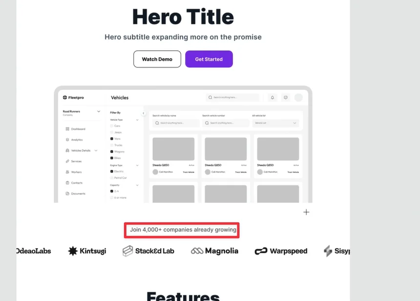
5. Social Proof: Build Trust Immediately
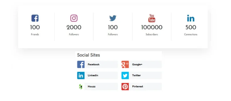
Users need proof that you’re credible.
Effective Social Proof Includes:
- Recognizable brand logos
- User counts (e.g. Trusted by 5,000+ teams)
- Awards or recognitions
You don’t need dozens of logos. Even 4–5 strong brands are enough to establish trust.
Social proof can appear:
- Inside the hero section
- Directly below it
6. Feature Section: Turn Features Into Benefits
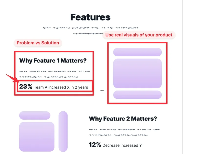
Most landing pages fail here.
Instead of listing features, structure them as:
Problem → Solution → Outcome
Example:
AI Automation
Save 10+ hours weekly with AI-powered task management
Add visuals that reflect real product usage, not abstract icons.
7. Supporting Stats: Reinforce Value
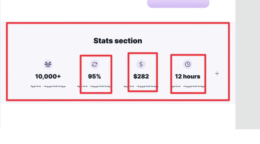
Stats help validate your claims and should appear before pricing.
Examples:
- Time saved per month
- Increase in conversion rates
- Money saved by customers
This section is optional but powerful if you have real data.
8. Case Studies: Real-World Proof
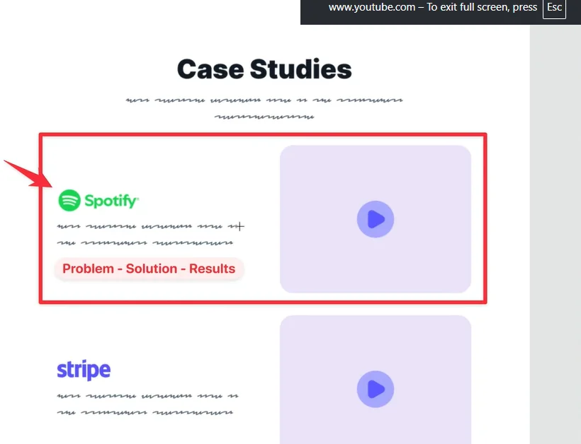
Case studies go deeper than testimonials.
Each case study should cover:
- The problem
- How your solution was used
- The results achieved
If possible, include:
- Recognizable brand names
- Short videos alongside text
Limit this section to 3–5 case studies for clarity.
9. Testimonials: Emotional Validation
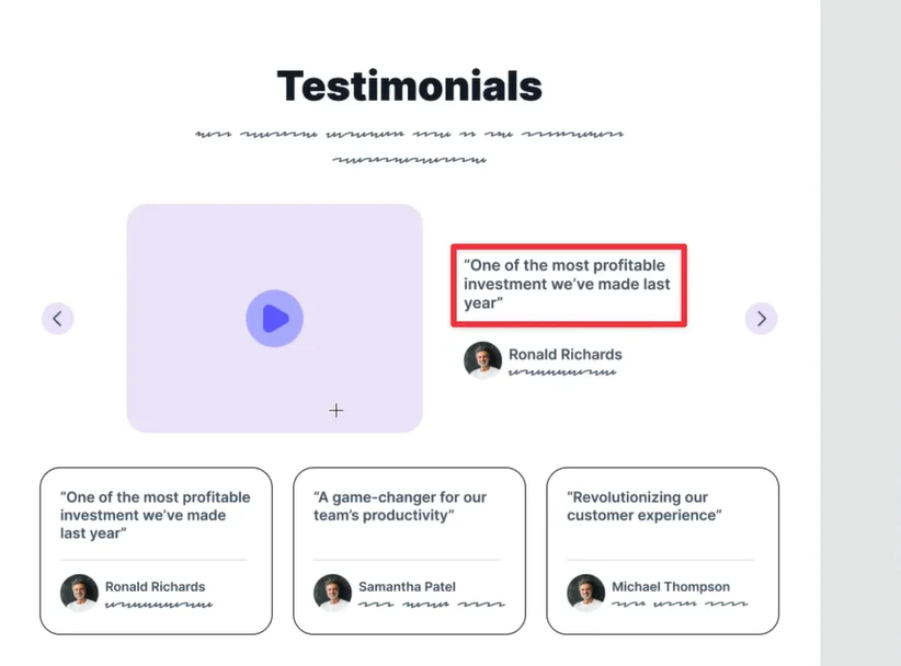
Testimonials create emotional trust.
Best Practices:
- Be specific with results
- Mention metrics and outcomes
- Include real names, photos, and titles
Video testimonials are ideal.
If unavailable, combine:
- 1 video testimonial
- 2–3 text testimonials
Avoid anonymous or text-only testimonials.
10. Pricing Section: Guide the Decision
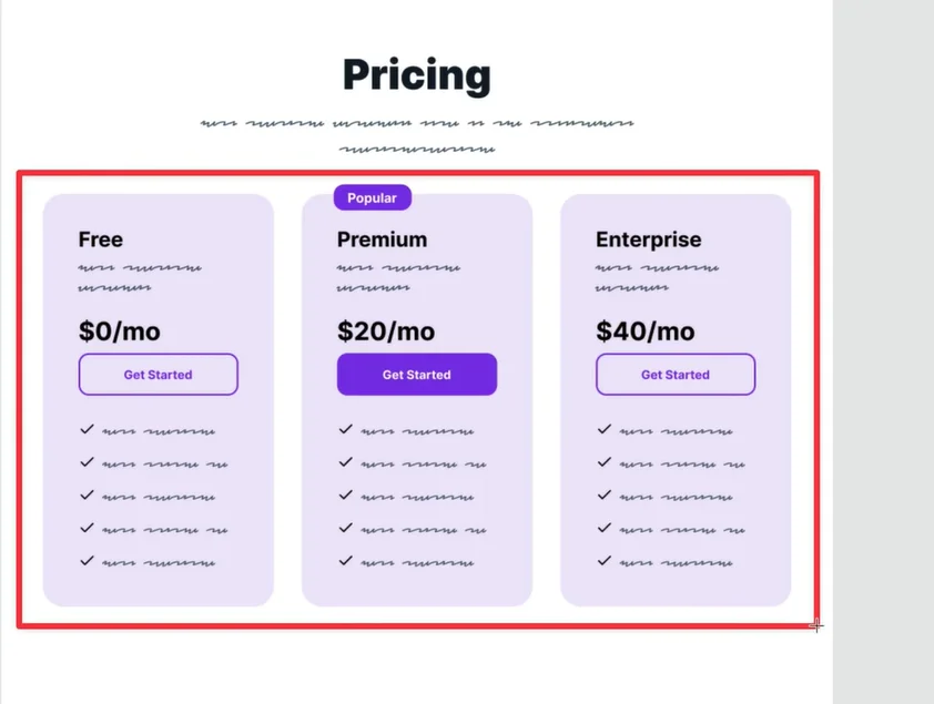
Pricing isn’t just about numbers — it’s about choice clarity.
Include:
- Clear plan comparison
- Highlight the most popular option
- Bullet points for key benefits
If pricing is complex, link to a detailed pricing page.
Adding:
- Free trials
- Guarantees
can significantly reduce friction.
11. FAQs: Remove Last-Minute Doubts
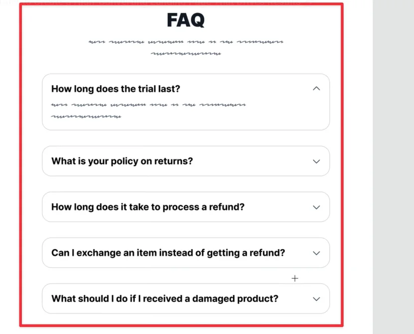
FAQs help address objections without cluttering the page.
Use them only if:
- Users commonly ask similar questions
- Pricing or onboarding needs clarification
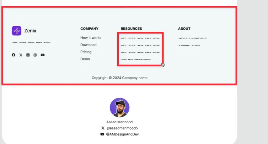
12. Footer: Support & Confidence Signals
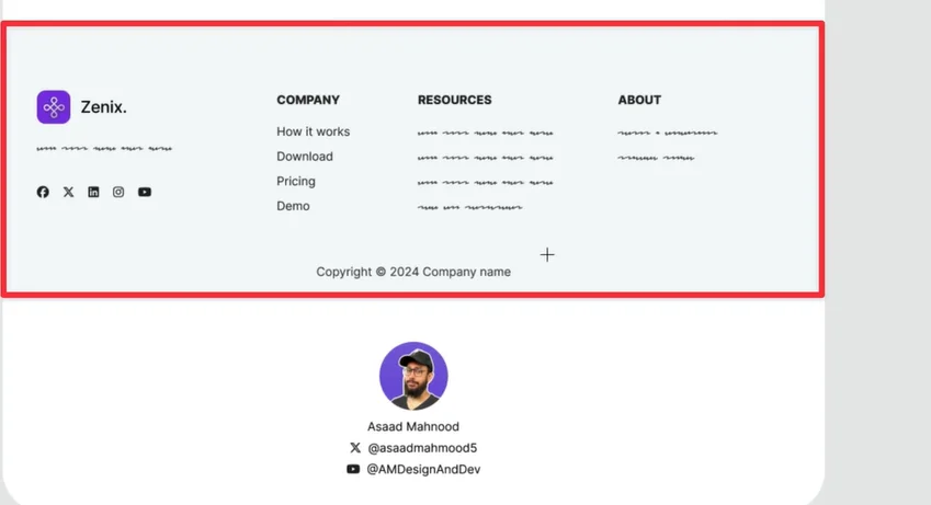
The footer is where users often look for reassurance.
Include:
- Contact details
- Privacy policy
- Terms of service
- Support links
You may also add a secondary CTA if needed.
Final Thoughts: Think Like the User
A high-converting landing page follows the user’s journey:
- Address pain points
- Communicate value clearly
- Build trust early
- Make action easy
When structure, messaging, and proof align, conversions naturally follow.
If you’re ready to elevate your online presence with a design that truly reflects your brand’s vision and goals, partner with The Small Square, your trusted team for creating modern, high-performing websites that drive real results.
With our proven expertise and dedicated approach, we’ll help you create a product that not only meets but exceeds your users’ expectations. Let’s work together to turn your vision into reality.


Accepted Payments

