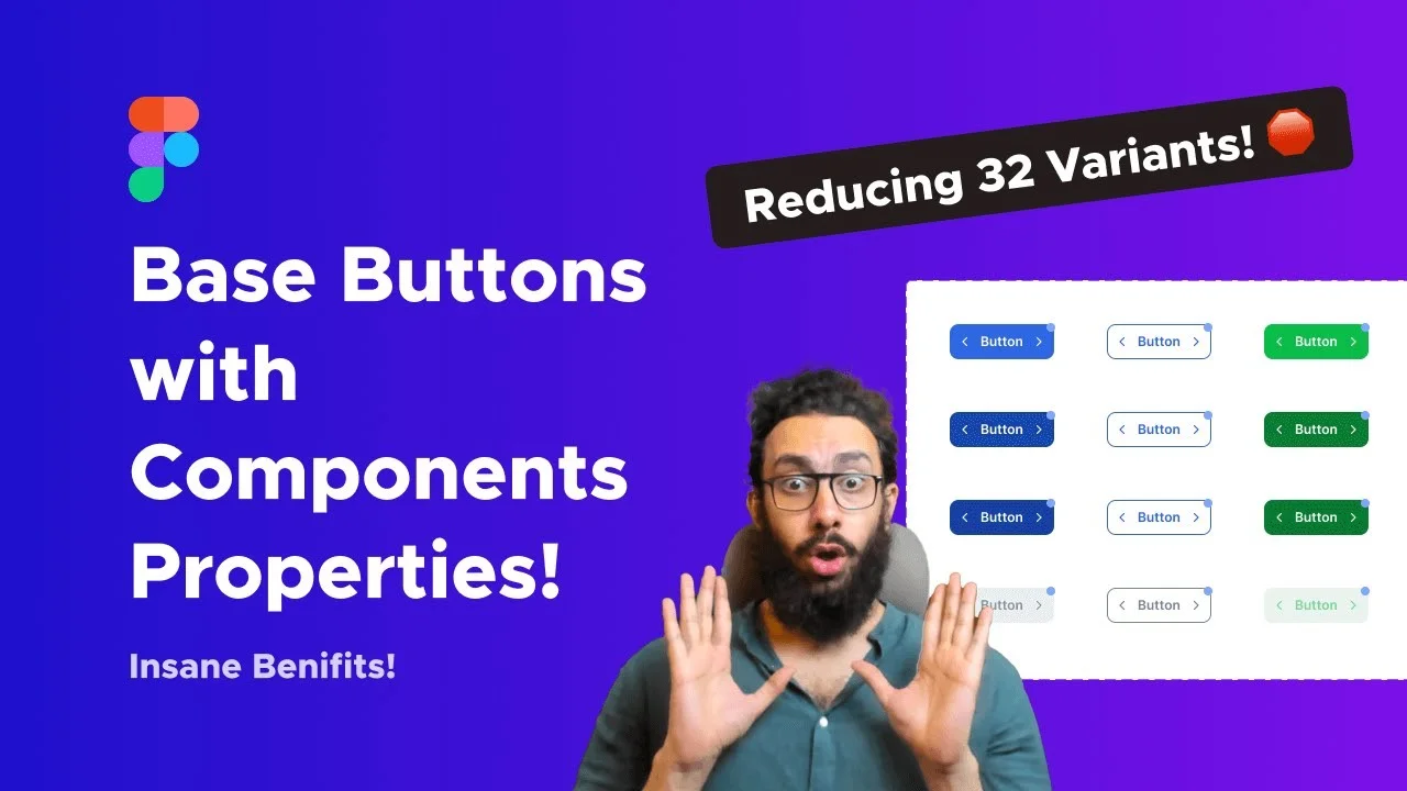
Base Buttons with Component Properties in Figma!
If you’re building a top mobile app development company, you know how important it is to keep your design system clean and scalable. When component properties were introduced in Figma, many designers—including myself—stopped using base structures for components like buttons. We started relying heavily on component properties and variants, which is fine… but not always efficient.
In this blog post, I’ll explain why base buttons are still extremely useful, and how they can save you hours of work when you need to update design systems.
The Problem with Relying Only on Component Properties
Let’s take a common example: a button with an icon.
Imagine you have multiple button variants:
- Small button
- Medium button
- Large button
- Primary, Secondary, Success, Danger
- Hover, Active, Disabled
Now, if the icon size inside the small buttons is currently 12px and you want to update it to 14px, what do you do?
The Manual Nightmare
You would have to:
- Open every small button variant
- Select the icon
- Change size to 14px
- Repeat for every state and type
If you have 16 variants, it becomes painful.
If you have 100 variants, it becomes insane.
This is exactly why base structures were created in the first place.
Why Base Buttons Still Matter
Using a base button structure lets you update elements in one place and automatically apply changes across all variants.
For example:
- Icon size
- Badge position
- Badge color
- Spacing
- Padding
- Anything else inside the button
This saves time and keeps your design system clean.
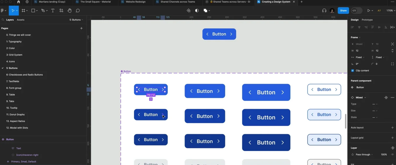
The Efficient Solution: Base Button + Nested Instances
Here’s what I do:
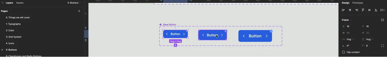
Step 1: Create a Base Button
Make a single base component that includes:
- Icon left
- Icon right
- Unread badge
- Padding
- Colors
- States
Step 2: Add Variants in the Main Component
Instead of creating hundreds of variants, I only create:
- Size (Small, Medium, Large)
- State (Default, Hover, Active, Disabled)
- Type (Primary, Secondary, Success, Danger)
Step 3: Use Component Properties
Expose nested instances from the base button so you can:
- Change icon size
- Toggle icons
- Toggle unread badge
- Change badge size
All without manually editing every variant.
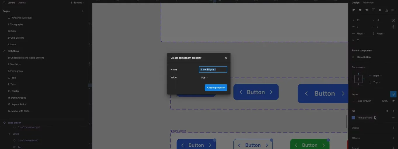
Example: Updating Icon Size in Seconds
If you want to update the icon size for all small variants, you just:
- Select the base icon property
- Change it from 12px to 14px
Done.
All variants update automatically.
That’s the power of base buttons.
The Bigger Benefit: Adding New Elements Easily
Let’s say you want to add an unread badge to every button.
If you are not using a base button, you would need to:
- Add badge to every variant
- Position it manually
- Adjust size for every variant
This is a waste of time.
With a base button, you just:
- Add badge once
- Create a property for it
- Toggle it ON/OFF in any instance
That’s it.
Base Buttons = Less Variants, Less Chaos
Instead of having 100+ variants, you can reduce it to a few base variants, such as:
- Size
- State
- Type
And then manage everything from one place.
This makes your design system:
1. More manageable
2. Faster to update
3. More scalable
4. Less error-prone
This approach is especially useful if you’re working in a webflow development agency, because you can quickly apply design changes across multiple variants without repeating work.
Important: Hug Content & Fixed Height
If you use Hug Contents, changing icon size will automatically change the button height.
This is great for flexible layouts, but you must be careful.
Example:
- If you increase icon size from 12px to 20px
- Button height will change automatically
If you want to maintain a fixed height (like 32px), you must adjust padding accordingly.
Final Thoughts
Base buttons are not outdated—they are still one of the most efficient ways to manage large design systems in Figma. Using base buttons with component properties saves time, reduces mistakes, and makes your design system scalable.
Even for complex products like saas development services, base buttons help maintain consistency and speed.
For more design system tips and tutorials, visit The Small Square.


Accepted Payments


